Getting Started With Gephi Network Visualisation App – My Facebook Network, Part II: Basic Filters
In Getting Started With Gephi Network Visualisation App – My Facebook Network, Part I I described how to get up and running with the Gephi network visualisation tool using social graph data pulled out of my Facebook account. In this post, I’ll explore some of the tools that Gephi provides for exploring a network in a more structured way.
If you aren’t familiar with Gephi, and if you haven’t read Part I of this series, I suggest you do so now…
…done that…?
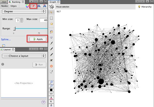
Okay, so where do we begin? As before, I’m going to start with a fresh worksheet, and load my Facebook network data, downloaded via the netvizz app, into Gephi, but as an undirected graph this time! So far, so exactly the same as last time. Just to give me some pointers over the graph, I’m going to set the node size to be proportional to the degree of each node (that is, the number of people each person is connected to).
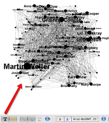
I can activate text labels for the nodes that are proportional to the node sizes from the toolbar along the bottom of the Graph panel:
…remembering to turn on the text labels, of course!
So – how can we explore the data visually using Gephi? One way is to use filters. The notion of filtering is incredibly powerful one, and one that I think is both often assumed and underestimated, so let’s just have a quick recap on what filtering is all about.
This maybe?
Filters – such as sieves, or colanders, but also like EQ settings and graphic, bass or treble equalisers on music players, colour filters on cameras and so on – are things that can be used to separate one thing from another based on their different properties. So for example, a colander can be used to separate green beans from the water it was boiled in, and a bass filter can be used to filter out the low frequency pounding of the bass on an audio music track. In Gephi, we can use filters to separate out parts of a network that have particular properties from other parts of the network.
The graph of Facebook friends that we’re looking at shows people I know as nodes; a line connecting two nodes (generally known as an edge) shows that that the two people represented by the corresponding nodes are also friends with each other. The size of the node depicts its degree, that is, the number of edges that are connected to it. We might interpret this as the popularity (or at least, the connectedness) of a particular person in my Facebook network, as determined by the number of my friends that they are also a friend of.
(In an undirected network like Facebook, where if A is a friend of B, B is also a friend of A, the edges are simple lines. In a directed network, such as the social graph provided by Twitter, the edges have a direction, and are typically represented by arrows. The arrow shows the direction of the relationship defined by the edge, so in Twitter an arrow going from A to B might represent that A is a follower of B; but if there is no second arrow going from B to A, then B is not following A.)
We’ve already used degree property of the nodes to scale the size of the nodes as depicted in the network graph window. But we can also use this property to filter the graph, and see just who the most (or least) connected members of my Facebook friends are. That is, we can see which people are friends of lots of the people am I friends of.
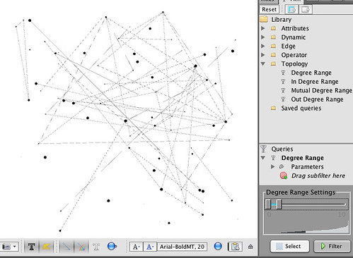
So for example – of my Facebook friends, which of them are friends of at least 35 people I am friends with? In the Filter panel, click on the Degree Range element in the Topology folder in the Filter panel Library and drag and drop it on to the Drag Filter Here
Adjust the Degree Range settings slider and hit the Filter button. The changes to allow us to see different views over the network corresponding to number of connections. So for example, in the view shown above, we can see members of my Facebook network who are friends with at least 30 other friends in my network. In my case, the best connected are work colleagues.
Going the other way, we can see who is not well connected:
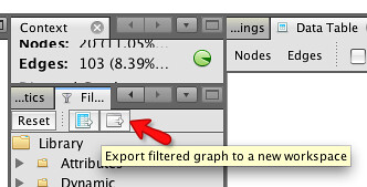
One of the nice things we can do with Gephi is use the filters to create new graphs to work with, using the notion of workspaces.
If I export the graph of people in my network with more than 35 connections, it is place into a nw workspace, where I can work on it separately from the complete graph.
Navigating between workspaces is achieved via a controller in the status bar at the bottom right of the Gephi environment:
The new workspace contains just the nodes that had 35 or more connections in the original graph. (I’m not sure if we can rename, or add description information, to the workspace? If you know how to do this, please add a comment to the post saying how:-)
If we go back to the original graph, we can now delete the filter (right click, delete) and see the whole network again.
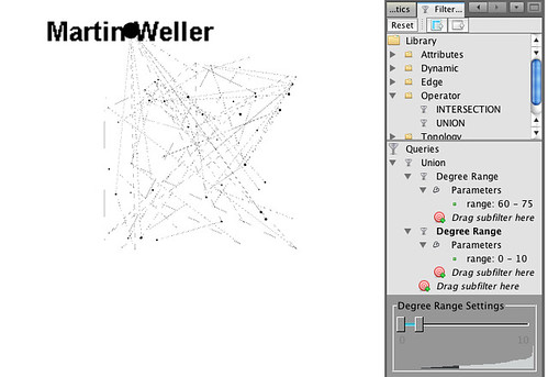
One very powerful filter rule that it’s worth getting to grips with is the Union filter. This allows you to view nodes (and the connections between them) of different filtered views of the graph that might otherwise be disjoint. So for example, if I want to look at members of my network with ten or less connections, but also see how they connect to each other to Martin Weller, who has over 60 connections, the Union filter is the way to do it:
That is, the Union filter will display all nodes, and the connections between them, that either have 10 or less connections, or 60 or more connections.
As before, I can save just the members of this subnetwork to a new workspace, and save the whole project from the File menu in the normal way.
Okay, that’s enough for now… have a play with some of the other filter options, and paste a comment back here about any that look like they might be interesting. For example, can you find a way of displaying just the people who are connected to Martin Weller?
