 Michael Wu, Ph.D. is Lithium's Principal Scientist of Analytics, digging into the complex dynamics of social interaction and online communities.
He's a regular blogger on the Lithosphere and previously wrote in the Analytic Science blog.
You can follow him on Twitter at mich8elwu.
Suppose you need to find the influencers for your brand in a community, how would you go about doing this? What kind of data do you need, and where do you start? Good question, today I am going to show you, step by step, how to find influencers in anonline community. I will use Lithium’s own online community, Lithosphere, in the following example, but you can do the same with any social media platform.
1. Identify the Necessary Data
From my earlier post “Finding the Influencers,” we know that an influencer must have high bandwidth and be credible. For finding high bandwidth users, our platform tracks participation velocity data for each user, and also collects a variety of social equity data. Our community platform also allows users to specify friends in the community. However, this feature is more common in enthusiasts’ communities than in other types of sites, so we have only a small amount of data to construct the friendship graph.
For finding credible users, we have reciprocity data (e.g. kudos and accepted solutions) and reputation data from our reputation engine. However, because our community platform does not require users to build an extensive user profile, we do not have self-proclaimed data on interest and expertise. As mentioned above, we probably do not have enough data to construct a reliable friendship graph, but friendship graph is less useful for finding credible users anyway. Since our community is a highly interactive platform with many topic-specific conversations among users, we can build a topic-specific conversation graph from the conversation data. Social network analysis (SNA) can then be applied to this social graph to accurately identify influencers.
From our analysis, we can see that our community platform has plenty of data for finding influencers, and we can pick and choose what data we would like to use. This may not be true on other platforms or other social media channels. As Philalluded to in his post, I took the SNA approach because it allows us to identify influencers reliably -- furthermore, it allows us to identify different types of influencers (see Are all Influencers Created Equal?).
2. Build the Relevant Social Graph
Most of the conversations in a branded community will already be focused around the brand, so they are likely all relevant. This eliminates the need to filter out irrelevant content. However, to ensure temporal relevance (i.e. timing), we still need to filter out temporally irrelevant (i.e. old) content before we build the conversation social graph. To do this, I filtered out all conversations that are older than one month and use only the data within this one month window.
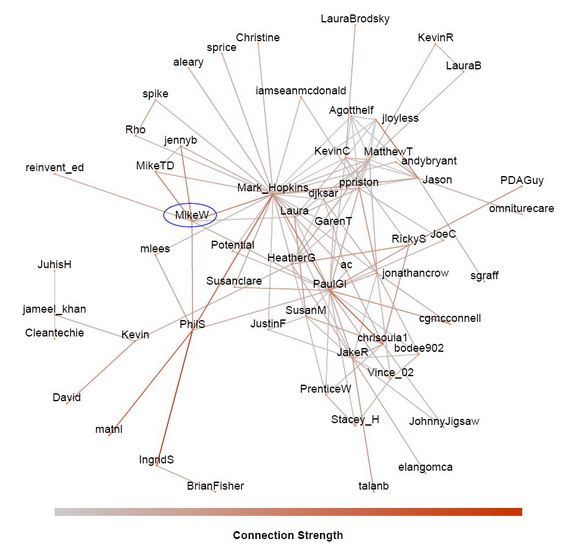
Within this relevant time window, I built the social graph by connecting two users if they have participated in a common conversation. So the relationship that is represented by the edges is co-participation in a conversation (recall that this edge relationship is the most important thing to keep in mind when reading social graphs). The conversation can be a thread in a forum, a blog article or an idea via comments. I also did something more sophisticated by computing the strength of connection between the two users, which is determined by three factors.
- The connection strength in a conversation is proportional to the number of messages a user contributed to a conversation. The more messages they contribute, the more likely they will be seen and remembered.
- The connection strength in a conversation is inversely proportional to the number of unique participants in the conversation. If there are more participants, then each user is less likely to be remembered.
- The connection strength is then summed across all the conversations where the two users have co-participated. The more conversations a pair of users co-participated in, the stronger the connection between them.
The result is the conversation graph shown here. The data is from Lithosphere for the one month period between 2010-03-05 and 2010-04-05. I labeled the users with their screen name. I can see myself, MikeW, and see that I’ve co-participated in conversations with seven other Lithosphere members (Mark_Hopkins, jennyb, MikeTD, reinvent_ed, Laura, PhilS, and PaulGi).

Since I have the connection strength between users, I could also filter out weak connections if necessary (when there are too many conversations in a community and the social graph becomes too cluttered to read). In this case, I didn’t need to do this because Lithosphere is still a small community; there were only 57 registered users co-participating in conversations within the one month period of interest. However, keep in mind that this does not mean that only 57 users posted. A user can post, but if no one replies, then there is no co-participation.
3. Social Network Analysis of the Conversation Graph
Once the social graph is built, the ‘hard work’ is done. The rest is number crunching using SNA and interpreting the results. SNA analyzes the social graph and computes node metrics that rank the importance of each user in the network. However, there are many ways that a user can be important. Some are well connected (have many connections), some are reputable (recognized by other important people), yet others may still be important in subtle ways. So SNA actually computes a series of node metrics depending on how we want to measure importance.
Currently, I’ve implemented 10 different such node metrics:
- Degree Centrality: How connected a user is, (depending on the edge relationship, this centrality measures the number of connections of a user -- friends, colleagues, etc.)
- Eigenvector Centrality: How reputable and recognized is a user
- PageRank Score: How much of an authority the user is (this is the same algorithm that Google uses to find authority web pages on the Internet)
- Potential reach: How many people can the user reach within two degrees
- Clustering Coefficient: How cliquish is the user (the probability that two of your friends are also friends with each other)
- Betweenness Centrality: How critical is the user for information diffusion
- Core Number: How central is the user in the network
- Vertex Eccentricity: How far away from the center is the user
- Closeness Centrality for the connected components: How close the user is to the rest of the connected component of the network
- Closeness Centrality for all components: How close the user is to the entire network, including disconnected components
You do not have to know all of them, but you should try to understand the common ones, such as degree centrality, Eigenvector centrality, PageRank score, and potential reach. I can overlay these node metrics on the social graph by mapping them to the size and color of the vertices, so we can visually see these metrics along with the social graph.

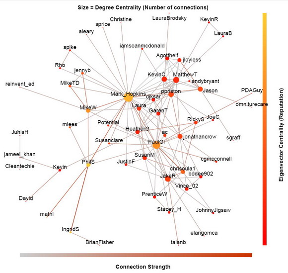
In the above social graph, I map the degree centrality (connectedness) to the size of the dots, and the eigenvector centrality (reputation) to their color. Clearly, Mark_Hopkins has the most connections as indicated by the biggest dot. However, PhilS is the most reputable as indicated by the most yellow color, even though he only talked to six users in that period. Although Mark_Hopkins, PaulGi, IngridS and I are not too far behind on the eigenvector centrality scale, the reason that PhilS is more reputable is because he has strong connections with other users (indicated by the brown edges) and that he is connected to a lot of other reputable users. Remember, how connected a user is does not necessarily correlate with his reputation.

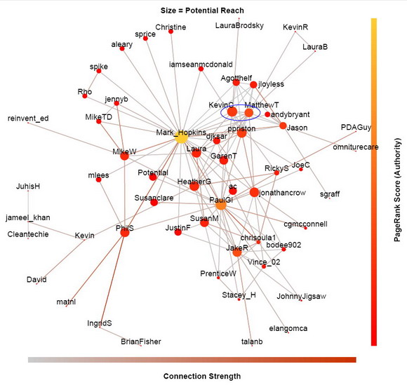
In this version of the social graph (above), I map the potential reach metric to the size of the dots, and the PageRank score to their color. Again, Mark_Hopkins has the greatest reach and the highest PageRankScore for the past month. But reach and authority is not always correlated either. For example, KevinC has greater reach than MatthewT in Lithosphere (KevinC is bigger dot), but MatthewT has higher authority than KevinC (MatthewT’s dot has more yellow tone).
I must emphasize that these ranking are only relevant for about a month window, because I have restricted the computation from 2010-03-05 to 2010-04-05. If we plot the social graph today, these node metrics could well be very different. So if you start participating more today, you may be one of the biggest and most yellow dots a month later.
Since Lithosphere is a pretty small community, most of these node metrics are quite well correlated. This will not be the case for larger communities. Therefore, depending on your marketing needs and constraints, you will need help from different kind of influencers in the community (see Are all Influencers Created Equal?).
Next week is our Lithium Network Confernece (LiNC2010). I will be there, so please come by and say hello if you will be attending. If not, we can always meet here at Lithosphere. Unless there are some special request at LiNC, I plan to show you some more social graphs from larger communities. But for now, I welcome any questions and comments as usual. See you next week at LiNC2010 or here at Lithosphere.
Lithosphere
No hay comentarios:
Publicar un comentario