17 Ways to Visualize the Twitter Universe
Flowing data

I just created a new Twitter account, and it got me to thinking about all the data visualization I've seen for Twitter tweets. I felt like I'd seen a lot, and it turns out there are quite a few. Here they are grouped into four categories - network diagrams, maps, analytics, and abstract.
Network Diagrams
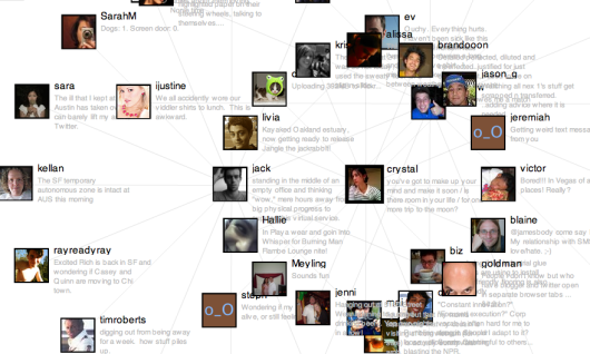
Twitter is a social network with friends (and strangers) linking up with each other and sharing tweets aplenty. These network diagrams attempt to show the relationships that exist among users.
Twitter Browser
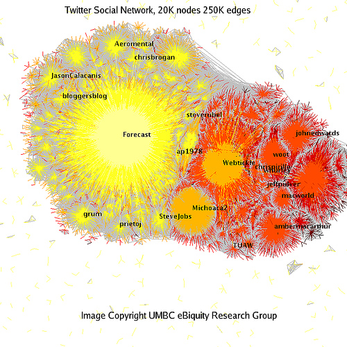
Twitter Social Network Analysis
The ebiquity group did some cluster analysis and managed to group tweets by topic.
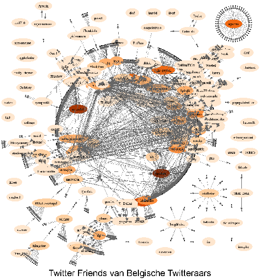
Twitter Vrienden
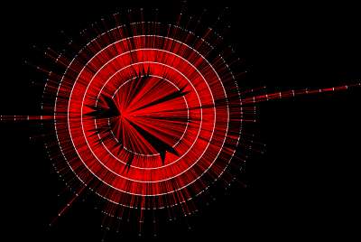
Twitter in Red
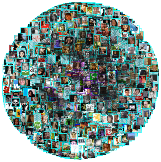
I'm not completely sure how to read this one. I looks like it starts from a single user and then shoots out into the network.
Twitter Network
Maps
When you create a Twitter account, you can enter where you are located, so in my case, I put New York. Because Tweets often have location attached to them, maps naturally lend themselves to tweet visualization.
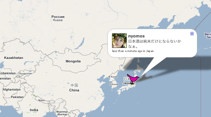
TwiterVision
Yeah, it's a Google Maps mashup, but a bit better than what you're used to seeing.
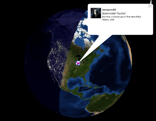
TwitterVision3d
It's TwitterVision taken to the next dimension.
Analytics
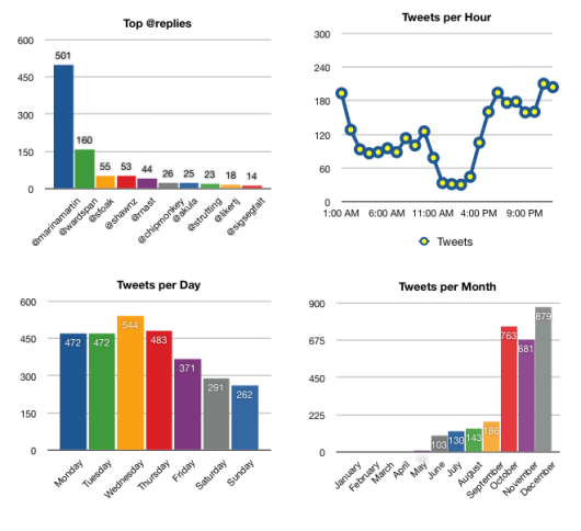
Maybe you don't care so much about the relationships or locations, but what you're really after is what everyone is Twittering about. These analytic visualization serve as a Twitter zeitgeist.
TweetStat
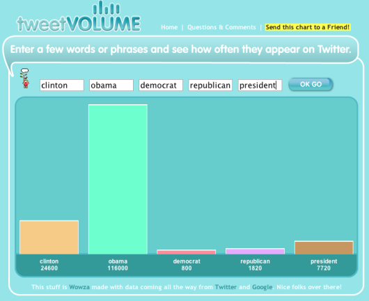
TweetVolume
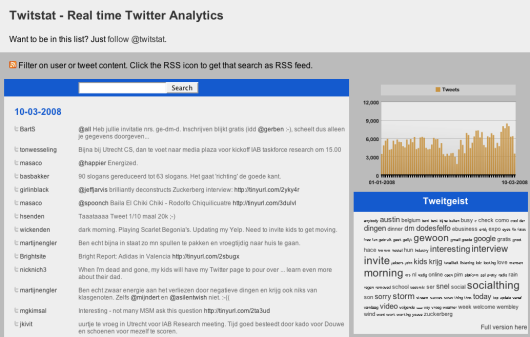
TwitStat
TwitterMeter
Abstract
They're not quite maps, not quite network diagrams, and not quite analytic tools. Rather they all follow some metaphor and encourage exploration.
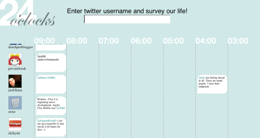
24 o'clocks
Is it just me, or does this sound like a really good name for a band?
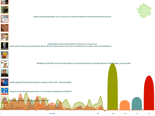
TweetPad
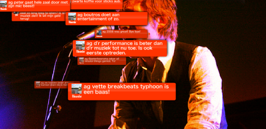
Created at the Visualizar workshop, it's actually more than just curves. In fact the blobbies are meant more for background while the main event is playing with the tweets.
Twitter Fountain
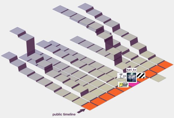
Twitter Blocks
Created by the folks at Stamen. I posted about Blocks when it came out.
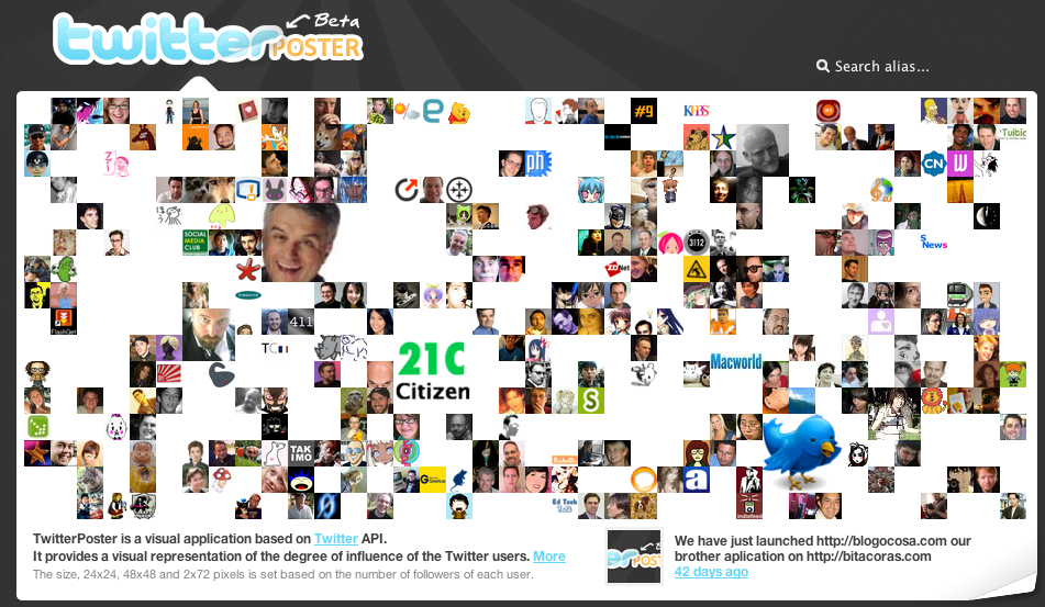
TwitterPoster
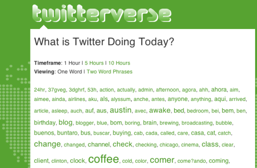
TwitterVerse
A lot, huh? All of these were made possible by the Twitter API that allows developers to access Twitter data for free. Did I miss any other Twitter visualizations? Please leave the link in the comments below.
Follow Me On Twitter
So now that you know what Twitter looks like, you can head on over and "follow" me; or if you don't have an account yet, you can create one in a few seconds.
If you don't know what Twitter is or wondering what the point is, here's a short video explaining Twitter in "plain English."

No hay comentarios:
Publicar un comentario