sábado, 26 de enero de 2013

Twitter en las inundaciones australianas


Social Network Analysis of Tweets During Australia Floods

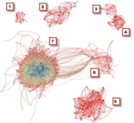
This study (PDF) analyzes the community of Twitter users who disseminated  information during the crisis caused by the Australian floods in 2010-2011. ”In times of mass emergencies, a phenomenon known as collective behavior becomes apparent. It consists of socio-behaviors that include intensified information search and information contagion.” The purpose of the Australian floods analysis is to reveal interesting patterns and features of this online community using social network analysis (SNA).
The authors analyzed 7,500 flood-related tweets to understand which users did the tweeting and retweeting. This was done to create nodes and links for SNA, which was able to “identify influential members of the online communities that emerged during the Queensland, NSW and Victorian floods as well as identify important resources being referred to. The most active community was in Queensland, possibly induced by the fact that the floods were orders of mag-nitude greater than in NSW and Victoria.”
The analysis also confirmed “the active part taken by local authorities, namely Queensland Police, government officials and volunteers. On the other hand, there was not much activity from local authorities in the NSW and Victorian floods prompting for the greater use of social media by the authorities concerned. As far as the online resources suggested by users are concerned, no sensible conclusion can be drawn as important ones identified were more of a general nature rather than critical information. This might be comprehensible as it was past the impact stage in the Queensland floods and participation was at much lower levels in the NSW and Victorian floods.”
Social Network Analysis is an under-utilized methodology for the analysis of communication flows during humanitarian crises. Understanding the topology of a social network is key to information diffusion. Think of this as a virus infecting a network. If we want to “infect” a social network with important crisis information as quickly and fully as possible, understanding the network’ topology is a requirement as is, therefore, social network analysis.

sábado, 19 de enero de 2013

Apariencias sociales enredadas


Redes sociales: ¿Todos mienten?

Un estudio asegura que en Facebook, Twitter y otras redes los hombres quieren parecer más inteligentes y las mujeres, más atractivas. Y que la imagen que todos muestran de sí mismos tiene poco que ver con la realidad. 

A solas

La sentencia es inapelable: en las redes sociales, casi todas las personas ofrecen imágenes mejoradas de sí mismas, proyectando en sus perfiles digitales lo que les gustaría ser, algo que poco se asemeja a la realidad. Las mujeres intentan mostrarse más atractivas y los hombres se preocupan por ofrecer una imagen divertida e inteligente. Lo revela una flamante encuesta realizada por Intel en Europa y Medio Oriente, bautizada UltraYou.
Sus conclusiones revelan que la conducta online de los usuarios ha cambiado mucho a partir de la explosión de las redes sociales. "En general, todo el mundo desea proyectar una versión mejorada de lo que son realmente", sostiene. Nuestra personalidad dentro del mundo digital es una proyección de los deseos y aspiraciones personales, que no siempre coincide con la realidad", explican.
La encuesta también registró diferencias de género. El 54 por ciento de las encuestadas reconoció retocar y manipular sus imágenes on line para verse más atractivas, algo que sólo hacen el 20 por ciento de los varones. Ellos, según los resultados del relevamiento, centran su esfuerzos en postear frases que les hagan parecer más interesantes e inteligentes, además de divertidos.
Otro dato interesante es que el estudio detectó diferencias entre países: en Holanda y la República Checa la gente presume en la red de su familia y de sus mascotas, mientras que en Egipto y en los Emiratos Árabes los encuestados intentan, en sus posteos y mensajes, que el personaje proyectado en la red tenga un aura más intelectual.

Sana desconfianza
Otro dato llamativo de la encuesta es que los usuarios son conscientes de que la gente, en las redes sociales, suele mentir: más de la mitad de los entrevistados dijeron que los mensajes que parecen ‘demasiado buenos para ser verdad’ delatan que hay detrás alguna exageración o alguna pose que no se condice con los hechos. Es más: 4 de cada 10 dicen que cuando la foto es muy pero muy buena y está claramente retocada con Photoshop, uno da por sentado que la persona miente.  


Entre mujeres

domingo, 9 de diciembre de 2012

Amargo Twitter de campañas políticas


Beyond "Bitter Twitter": Crowd-Photography for the Cyber-Tahrir Square

BY MICAH L. SIFRY | Tuesday, July 10 2012 - TechPresident


 A close-up view of @davidaxelrod's Twitter footprint from July 6, 2012


"This election may be remembered as the Bitter Twitter campaign," former Bush adviser Mark McKinnon said recently. With both campaigns avoiding offering any big new ideas, he predicted that "we are likely to see the next [few] months as a furious and relentless exchange of messages that aren't much longer or deeper than 140 characters."
Is that all that can be said about the daily Twitter wars between the Romney and Obama camps? To get a bigger picture — or rather, as you will see below, to get several bigger pictures — I turned to Marc A. Smith, chief social scientist with the Connected Action consulting group, who has long studied computer-mediated collective interaction. For the last few years, he and his colleagues have been doing what he chirpily calls "crowd photography for the cyber-Tahrir Square," using a sophisticated network mapping tool called NodeXL they've developed as a free extension to Excel. And the graphs they make offer a whole new way of seeing the connections among people, events and ideas as they coalesce online. Here, for example, is the conversation online when the "pink slime" controversy was at its height. Here's a chatter map for the controversy over "Fast and Furious"when Attorney General Eric Holder and Rep. Darrell Issa recently locked horns.
But how to read them? Take this snapshot of the public conversation on Twitter after the first day of this year's Personal Democracy Forum conference. Here, Smith got data on 711 Twitter users whose recent tweets contained the hashtag "#pdf12." Users are clustered together if they have lots of connection to each other, based on who follows whom, who replies to whom, and who mentions whom, and then each cluster is given its own rectangle based on those users having used similar hashtags in addition to #pdf12, with those listed in order of prominence.
Blue lines are links NodeXL builds when one user mentions, replies to or retweets another. Green lines represent people who follow each other. The "isolates" — in this case in the bottom right — are users who don't connect to others on the graph. "Reading" the graph (which I did with Smith's help), you can learn several things about the social landscape of the #PDF12 community.
There are three major subgroups that were tweeting from and about PDF12. First and largest, in the top left corner, are the open-government folks, whose top three hashtags after #PDF12 were #opengov, #opendata and #OGP (for the Open Government Partnership). At the center of this cluster, not surprising, you can see the Twitter avatars of power-tweeters like O'Reilly Media's Alex Howard (@digiphile), who covers open government and open data on a daily, even hourly, basis.
The second group in the top left are the PDF progressives, netroots folks who had likely just attended the annual Netroots Nation conference in Providence, RI. Their usage of hashtags like #NN12 and #ows (Occupy Wall Street) is a sure giveaway of their closeness to each other.
And third, in the bottom left corner of the graph, are the PDF netheads (you can recognize Zeynep Tufekci @techsoc, for example) who were paying closest attention to issues like online privacy, SOPA and PIPA.
A few additional observations are in order. First, there's not a lot of hierarchy to this community of individuals. There are lots of bilateral connections between people, as evinced by all the crosshatching green and blue lines. Second, the relatively large number of "isolates" in the bottom right corner is a good sign, Smith told me. It suggests that #PDF12 was also reaching beyond its core audience, and shows that we're not a completely "built-out" network. In other words, that there's room for growth. Network maps for other conferences, he says, often show that they're just speaking to themselves. And finally, the small cluster at the bottom of the middle of the graph indicates that there were probably some people using "pdf12" in their tweets during the conference who had absolutely nothing to do with the event, but maybe had some other common point of contact, such as linking to this document: http://www.eluniversal.com.mx/graficos/pdf12/recuento-eleccion.pdf.
Axelrod vs Fehrnstrom
Now take a look at how the Twitter conversation coalesces around two leading online surrogates for the Obama and Romney campaigns, David Axelrod and Eric Fehrnstrom. Axelrod is the Obama campaign's senior strategist; Fehrnstrom is one of Romney's senior campaign advisors. I asked Smith to run NodeXL against a recent list of Twitter users who either mentioned @davidaxelrod or @ericfehrn, and this is what he found.
Obviously, Axelrod's network is different than Fehrnstrom's. He has more than 103,000 followers on Twitter, compared to Fehrnstrom's 13,000. And he tweets more often, roughly 5-6 times a day, while Fehrnstrom tweets at most two or three times. As a result, their NodeXL graphs cover very different time periods. For Axelrod, it just took 13 hours on July 6th to accumulate 790 users who mentioned "davidaxelrod" in a tweet. It took 10 days, from June 27 thru July 6, to accumulate a similar number (876, actually) of users who mentioned "ericfehrn."
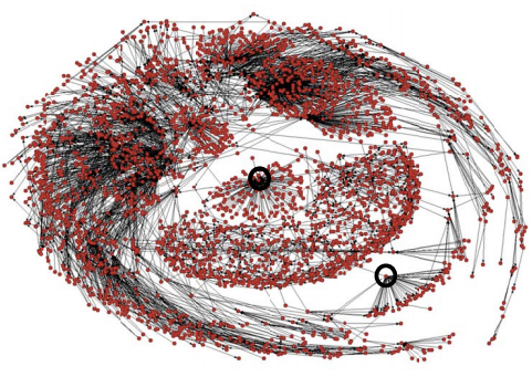
Here's the snapshot of Axelrod's Twittersphere around July 6th. You can view a high-definition "zoomable" version of the graph here.
What's immediately apparent from the network of Axelrod mentioners is a) how polarized it is, and b) how much the pro-Obama side looks like a broadcast network, while the anti-Obama side looks like a dense community. The polarization isn't surprising; Smith says this pattern repeats across many NodeXL scans on topics touching on American politics. The most active people in online politics are from the passionate poles of our two-party system; this is not news, but there are some hints in these particular graphs that the online right is different than the online left, at least on Twitter. More on that in the moment.
First, the pro-Obama side, which is distinguished by people using Obama-friendly hashtags like "yeswewill" and "bettingonAmerica" as well as anti-Romney terms like "bainmitt" and "whatsmitthiding." If you zoom in closely on the people near Axelrod who are interrelated (the green clump in the upper right quadrant around him), you'll find other media players like Ben Smith (@buzzfeedben), Michael Scherer of Time (@michaelscherer) and Ben LaBolt, an Obama spokesman (@benlabolt). But the rest of the network of mentioners around Axelrod aren't part of the media insider circle--there are just lots of Twitter users who follow the Obama campaign's senior adviser who talk him up.
There's a lot of blue lines in this graph — remember, those are links NodeXL builds when one user mentions, replies to, or retweets another. Green lines represent people who follow each other. Given how well known Axelrod is on Twitter, it's not surprising to find so many people who mention him but don't follow each other — hence the prominence of the blue over the green. This is another indication that his reach online is more like a broadcast network or a brand than an interlaced community.
"There is an 'audience' cluster and two 'community' clusters," Smith explains. "Most blue lines (replies, mentions, retweets) point in to the 'community' clusters in which there is significant amounts of mutual connection. The community clusters are dense, while the broadcast or audience cluster is sparse with little interconnection. Axelrod has a powerful broadcast ability and his messages reverberate within the community clusters."
On the top right we have people who are good bets to be anti-Obama, given their prominent use of the "top conservatives on Twitter" hashtag #tcot, as well as anti-Obama terms like "fastandfurious" — a reference to the Justice Department scandal — and "obamatax." This group has no obvious hub, but it's also densely inter-connected. This is typical of conservatives who are heavy Twitter users; a lot of people joined the service starting in early 2007 who were looking for new leadership on the right, and along the way they all found each other.
Now let's look at Eric Fehrnstrom's Twittersphere. A zoomable version is here.
As noted above, comparing Fehrnstrom's online footprint to Axelrod's isn't apples-to-apples. He's not as well-known, he's not on TV as often, and he isn't as big a Twitter user. Unfortunately for the purposes of this article, there isn't an exact parallel to Axelrod in the Romneyverse, at least when it comes to their online activities. So, caveat emptor, this isn't meant to suggest that what one man is doing online is somehow "better" than the other. They're each interesting but for somewhat different reasons.
Again, the most obvious finding from looking at people mentioning "ericfehrn" on Twitter is that they're a polarized group. The ones on the left hand side of the graphic are mostly pro-Romney; the ones on the right are mostly pro-Obama. We know this from the hashtags they're using in common: "obamacare," "obamatax" "fullrepeal" and "teaparty" for the Romneyites; and "p2" "aca" and "whatisromneyhiding" for the Obamanauts. (Smith has noticed that few Republicans ever say "Affordable Care Act," by the way.) On the Obama side of the split, you can zoom in and find individuals like Donna Brazile and Paul Begala, well-known Democratic partisans; on the other side you can find GOP stalwarts like Matt Lewis and Justin Hart.
Interestingly, you can see some signs of Fehrnstrom having a small "broadcast" footprint in the arc-like groups of Twitter users on the outer edge of the left-hand cluster. These are people like the much bigger circle around Axelrod, who mention or retweet things that "@ericfehrn" says, but who aren't really connected in a more intensive way as a community of people who know each other.
Don't Think of an Echo Chamber
When I first reached out to Smith, I thought that mapping the Twitter relationships of political power players like Axelrod and Fehrnstrom might demonstrate just how much Twitter was intensifying the insider culture of Washington and elite politics, to the chagrin of people like Mark McKinnon. But after looking at these graphs, I'm not so sure that that is the only thing going on with Twitter and the presidential campaigns.
Yes, there are a lot of A-list types showing up on these two graphs, the sort of people who have given the Washington-centric White House Correspondents Dinner its current reputation as the "nerdprom" for the media-politics elite, plus some hardworking journalists who are just doing their jobs. But at the same time, there's a much bigger network of influential voices in the political Twittersphere around the Romney and Obama camps, as is reflected by centrality in the graphs of people like @ttjemery ("Christian and conservative" with 29,000 followers), @daggy1 (a self-described "enemy of socialism" with 27,000 followers), or @gaypatriot ("America's leading gay conservative voice"). And this active and highly networked set of people clearly leans right; none of the top independent progressives on Twitter happen to show up as significant participants in these two snapshots.
What that suggests is that after you get past the daily "Bitter Twitter" back-and-forth games that these campaigns surrogates are playing with each other and the Beltway media, there's a large secondary group of political activists, most of them conservatives, who are also engaged in chewing on the daily give-and-take of the presidential campaign. A lot of these people know and relate to each other via Twitter. If progressive activists were as engaged on Twitter, then presumably we'd see the same kind of dense green cloud in interconnections around Axelrod on the pro-Obama side of his graph as we do for Fehrnstrom on the pro-Romney side of his. Arguably, the fact that Axelrod is much more of a "celebrity" online may explain some of this difference too.
NodeXL is a powerful tool for exploring the social landscapes of public conversations about all kinds of topics, but it takes time and effort to develop the visual literacy needed to make sense of these graphs. Or, as Smith puts it, "it takes time to go from seeing something that looks like bug splatter on my windshield to 'oh, that looks interesting.'" Over the coming months, we're going to keep exploring this terrain with Smith's help, as he has kindly offered to run some queries on techPresident's behalf. (He also does customized research for a modest fee.) What would you like to explore? We can visualize the network around a person or group of people, a term or hashtag, even a url. The zeitgeist awaits.


sábado, 8 de diciembre de 2012

Visualizando Facebook


Super Fan Facebook Graph


facebook_graph_notes
It’s pretty common to have a Facebook graph that consists of a few unconnected or only loosely connected clusters. In the visualization above there are distinct “constellations” of people I play cards with, people I worked with at Microsoft, people I am related to, people I went to high school with, and people I went to college with. Most of the people in those groups are fairly interconnected with each other but not at all connected to people in the other groups, or perhaps only loosely connected. For example the two nodes between 3 and 4 are my brothers who went to the same high school as me and therefore bring the high school and family clusters into proximity, but they aren’t connected to anyone I went to college with or have worked with in the past 10 years. Those clusters are the type of graphs I’d expect to see from the organic use patterns of a typical Facebook users, more or less.
So what’s with the really big blob? That’s the social network of someone who behaves like a very, very passionate fan of reality TV, in particular Big Brother and Survivor. I’ve been managing social media around theBig Brother Live Feeds for a while, and like my customers, I’ve connected to lots of stars and tons of fans. And all of those folks are connected to each other through multiple connections themselves. Over in constellation 6 are people I’ve worked with at RealNetworks, and the nodes connecting that group to super fan cluster are folks who work directly with customers, like our chat room moderators, my social media team, editors and video hosts, as well as some key folks in program management and operations.
Here’s the key if you’re curious
  1. Bridge players
  2. Microsoft friends (past gig)
  3. High school friends
  4. Family
  5. Knox College friends
  6. RealNetworks (current gig)
  7. Reality TV fans
Aside from the density of connections, you can see by the size of the circle which nodes are highly connected. The average number of connections in the graph is 55 but that average is thrown off by the folks represented by the very large circles, who have between 150 and 200 connections each. Some of those are stars who have been on the shows–and reality stars tend to be very accessible and connected on both Facebook and Twitter. They don’t just accept friend requests from fans, they will actively and frequently engage. However, it’s worth pointing out that some of the most connected members of my graph are just fans. They are the type of fans who will travel to Las Vegas after the season is over to party with the stars. They know each other very well and are as connected and influential in the fan community (and among my customer base) as any of the stars or casting directors.
Here’s a close up of the Reality TV fans
fan_cluster_close
And here are the high school / family clusters so you can see just how much sparser the connections are
family_highschool
Note: This post was an extension of the first week’s lesson of the Coursera course Social Network Analysis taught by Lada Adamic. Thanks, Lada!  The visualization tool I used is Gephi.

Performing Statements


martes, 27 de noviembre de 2012

Redes de amor adolescente


Love is a Battlefield Spanning-Tree Network with no 4-Cycles

by KIERAN HEALY


Quick, in high school were you ever told not to date your old girlfriend’s current boyfriend’s old girlfriend? Or your old boyfriend’s current girlfriend’s old boyfriend? Probably not. But I bet you never did, either. This month’s American Journal of Sociology has a very nice paper (subscription only, alas) by Peter BearmanJim Moody and Katherine Stovel about the structure of the romantic and sexual network in a population of over 800 adolescents at “Jefferson High” in a midsized town in the midwestern United States. They got a pretty well-bounded population (a high school included in the AddHealth study) and mapped out all the connections between the students. Read on for the lurid details.
The authors found that the observed network isn’t well-represented by existing models, which are mainly concerned with predicting how STDs propagate through populations and have often been based on ego-centered network data. These are surveys where you ask the respondents about their sexual networks, but the respondents aren’t necessarily in the same network. Here’s a picture of four kinds of network:

Core models posit a small group of very sexually-active individuals who occasionally come into contact with (and infect) those outside the core. Bridge models think in terms of an infected component and an uninfected component which join at some point. The biggest network component observed at Jefferson High turned out to be the fourth type, however: a “spanning tree” structure. This is “a long chain of interconnections that stretches across a population, like rural phone wires running from a long trunk line to individual houses … characterized by a graph with few cycles, low redundancy, and consequently very sparse overall density.” When they tried to simulate this bit of the graph structure, the authors found they could get most of the way there using a simple model where the probability of a tie depended on individuals having a preference for others with the same amount of sexual experience as themselves.[1] But simulated networks based on this model didn’t quite match the properties of the observed network. In particular, while the simulations had cycles of length 4, the Jefferson High network did not.
What’s a cycle? If you start at Crooked Timber and click over to Dan Drezner and then click Dan’s link to Mark Kleiman and then return to Crooked Timber via Mark’s link to us, you’ve completed a cycle of length 3: a walk through the network that starts and ends with the same actor and where all the other actors are different and not repeated along the way. Cycles of length 3 are the smallest possible cycles. When it comes to tracing paths through heterosexual relationships, though, the smallest possible cycles are of length 4. In order to make a cycle beginning and ending with yourself, you need two members of the opposite sex plus one intervening individual the same sex as you. It turns out that this kind of cycle is just not found in the Jefferson High network. Although there’s no explicit taboo or social norm against that kind of pattern, nevertheless people just don’t date their old partner’s current partner’s old partner.
From the perspective of males or females (and independent of the pattern of “rejection”), a relationship that completes a cycle of length 4 can be thought of as a “seconds partnership,” and therefore involves a public loss of status. Most adolescents would probably stare blankly at the researcher who asked boys: Is there a prohibition in your school against being in a relationship with your old girlfriend’s current boyfriend’s old girlfriend? It is a mouthful, but it makes intuitive sense. … For adolescents, the consequence of this prohibition is of little interest: what concerns them is avoiding status loss. But from the perspective of those interested in understanding the determinants of disease diffusion, the significance of a norm against relationships that complete short cycles is profound. The structural impact of the norm is that it induces a spanning tree, as versus a structure characterized by many densely connected pockets of activity (i.e., a core structure).
Individuals constitute social structures, yet those structures have properties that the members do not know about and can’t easily grasp—our vast amount of folk knowledge about our social relations notwithstanding. These properties can have all kinds of serious consequences. The “No 4-cycles” rule is interesting because on the one hand it reflects a very simple bit of structure and it’s not something that’s prohibited in any strong normative sense. I’m not sure I buy the authors’ status-based explanation for it, though. They suggest some alternatives—“’jealousy’ or the avoidance of too much ‘closeness,’ a sentiment perhaps best described unscientifically as the ‘yuck factor.’” I find the yuck-factor idea more intriquing: I wonder whether it’s more likely to show up at the limits of easily-described network structures. Bigger cycles defy easy verbal description altogether and are also subject to lack of information because some of the ties will be in the past or far away, so they’re not subject to avoidance. Dyadic ties are easy to keep track of. Short cycles are still tricky to grasp, but it’s not that hard, so being able to trace them triggers the taboo-like “yuck” response.
As for consequences, the spanning-tree structures created by experience homophily plus the 4-cycle rule are very effective at propagating diseases along their chains. But they are also easy to break in a way that core-type networks are not:
Under core and inverse core structures, it matters enormously which actors are reached, while under a spanning tree structure the key is not so much which actors are reached, just that some are. This is because given the dynamic tendency for unconnected dyads and triads to attach to the main component, the structure is equally sensitive to a break (failure to transmit disease) at any site in the graph. In this way, relatively low levels of behavior changeeven by low-risk actors, who are perhaps the easiest to influence can easily break a spanning tree network into small disconnected components, thereby fragmenting the epidemic and radically limiting its scope.
fn1. Homophily, or the tendency do associate with others with similar traits to oneself, is a powerful social force that explains a great deal about the structure of social networks—in this case, homophily on experience.

Crooked Timber

Influencia en comunidades


Community Influencers Step by Step

by  


michaelwu.jpgMichael Wu, Ph.D. is Lithium's Principal Scientist of Analytics, digging into the complex dynamics of social interaction and online communities.

He's a regular blogger on the Lithosphere and previously wrote in the Analytic Science blog.

You can follow him on Twitter at mich8elwu.


Suppose you need to find the influencers for your brand in a community, how would you go about doing this? What kind of data do you need, and where do you start? Good question, today I am going to show you, step by step, how to find influencers in anonline community. I will use Lithium’s own online community, Lithosphere, in the following example, but you can do the same with any social media platform.

1. Identify the Necessary Data
From my earlier post “Finding the Influencers,” we know that an influencer must have high bandwidth and be credible. For finding high bandwidth users, our platform tracks participation velocity data for each user, and also collects a variety of social equity data. Our community platform also allows users to specify friends in the community. However, this feature is more common in enthusiasts’ communities than in other types of sites, so we have only a small amount of data to construct the friendship graph.

For finding credible users, we have reciprocity data (e.g. kudos and accepted solutions) and reputation data from our reputation engine. However, because our community platform does not require users to build an extensive user profile, we do not have self-proclaimed data on interest and expertise. As mentioned above, we probably do not have enough data to construct a reliable friendship graph, but friendship graph is less useful for finding credible users anyway. Since our community is a highly interactive platform with many topic-specific conversations among users, we can build a topic-specific conversation graph from the conversation data. Social network analysis (SNA) can then be applied to this social graph to accurately identify influencers.

From our analysis, we can see that our community platform has plenty of data for finding influencers, and we can pick and choose what data we would like to use. This may not be true on other platforms or other social media channels. As Philalluded to in his post, I took the SNA approach because it allows us to identify influencers reliably -- furthermore, it allows us to identify different types of influencers (see Are all Influencers Created Equal?).

2. Build the Relevant Social Graph
Most of the conversations in a branded community will already be focused around the brand, so they are likely all relevant. This eliminates the need to filter out irrelevant content. However, to ensure temporal relevance (i.e. timing), we still need to filter out temporally irrelevant (i.e. old) content before we build the conversation social graph. To do this, I filtered out all conversations that are older than one month and use only the data within this one month window.

Within this relevant time window, I built the social graph by connecting two users if they have participated in a common conversation. So the relationship that is represented by the edges is co-participation in a conversation (recall that this edge relationship is the most important thing to keep in mind when reading social graphs). The conversation can be a thread in a forum, a blog article or an idea via comments. I also did something more sophisticated by computing the strength of connection between the two users, which is determined by three factors.
  1. The connection strength in a conversation is proportional to the number of messages a user contributed to a conversation. The more messages they contribute, the more likely they will be seen and remembered.
  2. The connection strength in a conversation is inversely proportional to the number of unique participants in the conversation. If there are more participants, then each user is less likely to be remembered.
  3. The connection strength is then summed across all the conversations where the two users have co-participated. The more conversations a pair of users co-participated in, the stronger the connection between them.

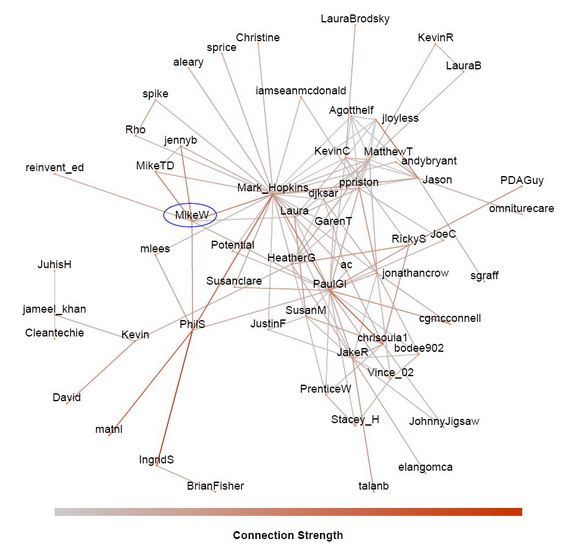
The result is the conversation graph shown here. The data is from Lithosphere for the one month period between 2010-03-05 and 2010-04-05. I labeled the users with their screen name. I can see myself, MikeW, and see that I’ve co-participated in conversations with seven other Lithosphere members (Mark_Hopkins, jennyb, MikeTD, reinvent_ed, Laura, PhilS, and PaulGi).

lithoSocGraph_resize.jpg

Since I have the connection strength between users, I could also filter out weak connections if necessary (when there are too many conversations in a community and the social graph becomes too cluttered to read). In this case, I didn’t need to do this because Lithosphere is still a small community; there were only 57 registered users co-participating in conversations within the one month period of interest. However, keep in mind that this does not mean that only 57 users posted. A user can post, but if no one replies, then there is no co-participation.

3. Social Network Analysis of the Conversation Graph
Once the social graph is built, the ‘hard work’ is done. The rest is number crunching using SNA and interpreting the results. SNA analyzes the social graph and computes node metrics that rank the importance of each user in the network. However, there are many ways that a user can be important. Some are well connected (have many connections), some are reputable (recognized by other important people), yet others may still be important in subtle ways. So SNA actually computes a series of node metrics depending on how we want to measure importance.

Currently, I’ve implemented 10 different such node metrics:
  1. Degree Centrality: How connected a user is, (depending on the edge relationship, this centrality measures the number of connections of a user -- friends, colleagues, etc.)
  2. Eigenvector Centrality: How reputable and recognized is a user
  3. PageRank Score: How much of an authority the user is (this is the same algorithm that Google uses to find authority web pages on the Internet)
  4. Potential reach: How many people can the user reach within two degrees
  5. Clustering Coefficient: How cliquish is the user (the probability that two of your friends are also friends with each other)
  6. Betweenness Centrality: How critical is the user for information diffusion
  7. Core Number: How central is the user in the network
  8. Vertex Eccentricity: How far away from the center is the user
  9. Closeness Centrality for the connected components: How close the user is to the rest of the connected component of the network
  10. Closeness Centrality for all components: How close the user is to the entire network, including disconnected components

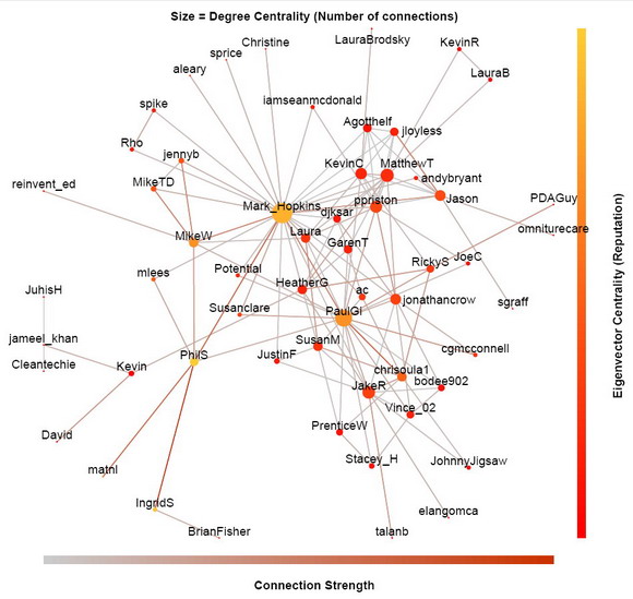
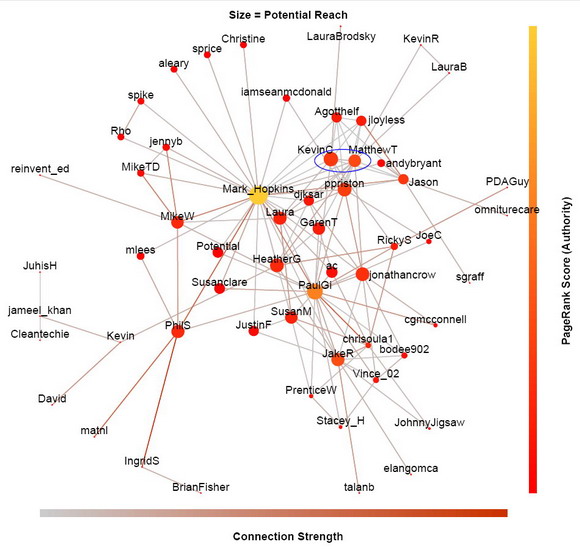
You do not have to know all of them, but you should try to understand the common ones, such as degree centrality, Eigenvector centrality, PageRank score, and potential reach. I can overlay these node metrics on the social graph by mapping them to the size and color of the vertices, so we can visually see these metrics along with the social graph.

lithoSocGraph_degree+eigenvector_resize.jpg

In the above social graph, I map the degree centrality (connectedness) to the size of the dots, and the eigenvector centrality (reputation) to their color. Clearly, Mark_Hopkins has the most connections as indicated by the biggest dot. However, PhilS is the most reputable as indicated by the most yellow color, even though he only talked to six users in that period. Although Mark_Hopkins, PaulGi, IngridS and I are not too far behind on the eigenvector centrality scale, the reason that PhilS is more reputable is because he has strong connections with other users (indicated by the brown edges) and that he is connected to a lot of other reputable users. Remember, how connected a user is does not necessarily correlate with his reputation.

lithoSocGraph_reach+pageRank_resize.jpg

In this version of the social graph (above), I map the potential reach metric to the size of the dots, and the PageRank score to their color. Again, Mark_Hopkins has the greatest reach and the highest PageRankScore for the past month. But reach and authority is not always correlated either. For example, KevinC has greater reach than MatthewT in Lithosphere (KevinC is bigger dot), but MatthewT has higher authority than KevinC (MatthewT’s dot has more yellow tone).

I must emphasize that these ranking are only relevant for about a month window, because I have restricted the computation from 2010-03-05 to 2010-04-05. If we plot the social graph today, these node metrics could well be very different. So if you start participating more today, you may be one of the biggest and most yellow dots a month later.

Since Lithosphere is a pretty small community, most of these node metrics are quite well correlated. This will not be the case for larger communities. Therefore, depending on your marketing needs and constraints, you will need help from different kind of influencers in the community (see Are all Influencers Created Equal?).

Next week is our Lithium Network Confernece (LiNC2010). I will be there, so please come by and say hello if you will be attending. If not, we can always meet here at Lithosphere. Unless there are some special request at LiNC, I plan to show you some more social graphs from larger communities. But for now, I welcome any questions and comments as usual. See you next week at LiNC2010 or here at Lithosphere.


Lithosphere