Mostrando entradas con la etiqueta Mathematica. Mostrar todas las entradas

lunes, 27 de noviembre de 2017

Analizando las redes del Boston colonial con Mathematica

Analizar las redes sociales de los revolucionarios de Boston con el lenguaje de Wolfram

Swede White, Especialista en Medios y Comunicaciones
Wolfram Blog


A medida que se acerca el 4 de julio, muchos en América celebrarán 241 años desde que los fundadores de los Estados Unidos de América firmaron la Declaración de Independencia, su propia y revolucionaria empresa revolucionaria. Antes de la independencia, los colonos celebraban el nacimiento del rey. Sin embargo, después de la Guerra Revolucionaria estalló en abril de 1775, algunos colonos comenzaron a celebrar funerales simulados del Rey Jorge III. Además, las hogueras, los cañonazos festivos y el fuego de mosquetes y los desfiles eran comunes, junto con las lecturas públicas de la Declaración de Independencia. También había ron.
Hoy, a menudo celebramos con barbacoa, fuegos artificiales y una serie de otras festividades. Como aspirante a nerd de datos y sociólogo, pensé que usaría Wolfram Language para explorar la Declaración de Independencia usando un procesamiento básico del lenguaje natural.
Usando metadatos, también exploraré una red política de colonos con especial atención prestada a Paul Revere, utilizando las funciones integradas de Wolfram Language y la ciencia de redes para descubrir algunas verdades ocultas sobre el Boston colonial y sus actores clave antes de la firma de la Declaración de la independencia.

La Declaración de Independencia y el repositorio de datos de Wolfram

Wolfram Data Repository se anunció recientemente y contiene una creciente colección de recursos interesantes para resultados fácilmente computables.


Da la casualidad que el repositorio de datos de Wolfram incluye el texto completo de la Declaración de Independencia. Exploremos el documento con WordCloud, tomándolo primero del Repositorio de Datos.


Interesante, pero esto no es muy patriótico por tema, así que use ColorFunction y luego use DeleteStopwords para eliminar a los firmantes del documento.


Como podemos ver, Wolfram Language ha eliminado los nombres de los firmantes y ampliado las palabras en función de su frecuencia en la Declaración de Independencia. Lo que destaca es que las palabras "leyes" y "personas" aparecen con mayor frecuencia. Esto no es terriblemente sorprendente, pero echemos un vistazo al uso histórico de esas palabras usando la funcionalidad incorporada de WordFrequencyData y DateListPlot para la visualización. Siguiendo con un tema patriótico, usemos también PlotStyle para hacer que la trama sea roja y azul.


Lo que es increíblemente interesante es que podemos ver un pico de uso alrededor de 1776 en ambas palabras. La divergencia entre el uso de las dos palabras a lo largo del tiempo también me parece interesante.

Una red social de Boston colonial

Según los textos históricos, el Boston colonial era un lugar fascinante a fines del siglo XVIII. La monografía de David Hackett Fischer, El viaje de Paul Revere, presenta una imagen completa de las facciones políticas que estaban impulsando el movimiento revolucionario. De particular interés son las logias masónicas y grupos de caucus que fueron políticamente activos y centrales para la Guerra Revolucionaria.
Aquellos de nosotros que crecimos en los Estados Unidos probablemente recordaremos a Paul Revere de nuestras primeras clases de historia en Estados Unidos. Él famoso cabalgó un caballo a través de lo que ahora es la gran área de Boston advirtiendo a la milicia colonial de las tropas británicas entrantes, conocido como su "paseo de medianoche", notablemente capturado en un poema de Henry Wadsworth Longfellow en 1860.
Hasta la exploración de Fischer de las asociaciones políticas y membresías de las bancadas de Paul Revere, los historiadores argumentaron que el movimiento rebelde colonial estaba controlado por élites políticas de alto rango lideradas por Samuel Adams, y muchos concluyeron que Revere era simplemente un mensajero. Eso era, pero a través de ese mensaje y otras actividades, fue clave para unir grupos políticos que de otro modo podrían no haberse comunicado, como mostraré a través del análisis de redes.
Da la casualidad que esta vez el año pasado estuve en la Wolfram Summer School, actualmente en curso en Bentley University. Uno de los aspectos más destacados de mi tiempo fue una conferencia sobre análisis de redes sociales, dirigida por Charlie Brummitt, que utilizó metadatos para analizar rebeldes coloniales en Boston.
El sociólogo de la Universidad de Duke, Kieran Healy, tiene una fantástica publicación en el blog que explora el tema "Uso de metadatos para encontrar a Paul Revere" de la cual se deriva la conferencia. Voy a recrear algunos de sus análisis con Wolfram Language y llevar las cosas un poco más allá con visualizaciones más avanzadas.

"Recuerda a las mujeres"

En primer lugar, sin embargo, como sociólogo, mis estudios e investigaciones a menudo se refieren a las desigualdades, el poder y los grupos marginados. Sería negligente si no hubiera pensado en la correspondencia de Abigail Adams con su esposo John Adams el 31 de marzo de 1776, en la que ella le instruyó a "recordar a las damas" en las actas del Congreso Continental. Hice una WordCloud de la carta aquí.


Los datos que estamos utilizando se refieren exclusivamente a hombres y datos de membresía de organizaciones sociales y políticas exclusivamente masculinas. Vale la pena señalar que durante el período Revolucionario, y durante bastante tiempo después, a las mujeres se les prohibió legalmente participar en la mayoría de los asuntos políticos. Las mujeres podían votar en algunos estados, pero entre 1777 y 1787, esos derechos fueron despojados en todos los estados excepto Nueva Jersey. No fue hasta el 18 de agosto de 1920 cuando se aprobó la 19ª Enmienda, lo que garantizó el derecho de las mujeres a votar de manera inequívoca.
Con ese fin, según el derecho consuetudinario inglés, las mujeres eran tratadas como fem encubiertas, lo que significaba que los derechos de las mujeres casadas eran absorbidos por sus maridos. No solo no se les permitía votar, las leyes de cobertura dictaban que el esposo y la esposa eran una sola persona, ya que el primero tenía la autoridad exclusiva para tomar decisiones políticas, así como la capacidad de comprar y vender propiedades y ganar salarios.
Después de la Revolución Americana, Estados Unidos estuvo libre de la tiranía del Rey Jorge III; sin embargo, las mujeres seguían estando sumisas a los hombres legal y culturalmente. Por ejemplo, Hannah Griffitts, una poeta conocida por su trabajo sobre las Hijas de la Libertad, "The Female Patriots", expresada en un diario de 1785, sentimientos de entrada comunes entre muchas mujeres coloniales:
The glorious fourth—again appears
A Day of Days—and year of years,
The sum of sad disasters,
Where all the mighty gains we see
With all their Boasted liberty,
Is only Change of Masters.
Hay pocas dudas de que sin el trabajo doméstico y emocional de las mujeres, a menudo invisible en la historia, estos hombres, los llamados Padres Fundadores, habrían sido menos exitosos y expeditos en el logro de sus objetivos de independencia de Gran Bretaña. Así que hoy, recordamos a las mujeres, los marginados y los privados de derechos.

Grupos políticos del Boston colonial: obtención de datos y análisis exploratorio

Convenientemente, cargué una matriz de asociación limpia de miembros de grupos políticos en Boston colonial como ResourceObject para el Repositorio de Datos. Importaremos con ResourceData para proporcionarnos un buen marco de datos con el que trabajar.


Podemos ver que tenemos 254 colonos en nuestro conjunto de datos. Echemos un vistazo a los grupos coloniales rebeldes de los que Samuel Adams era miembro, ya que es conocido en la actualidad por ser un ingrediente clave en las celebraciones del 4 de julio, la cerveza.


Nuestros valores True/False indican membresía en una de las siete organizaciones políticas: St. Andrews Lodge, Loyal Nine, North Caucus, Long Room Club, Tea Party, Boston Committee of Correspondence y London Enemies.
Podemos ver que Adams fue miembro de cuatro de estos. Echemos un vistazo a las membresías de Revere.


Como podemos ver, Revere fue un poco más involucrado, ya que es miembro de cinco grupos. Podemos graficar fácilmente su membresía en estas organizaciones políticas. Para aquellos de ustedes que no están familiarizados con el funcionamiento de una red, los nodos representan a los agentes y las líneas entre ellos representan algún tipo de conexión, interacción o asociación.


Hay siete organizaciones en total, así que veamos cómo están conectadas destacando las organizaciones políticas como nodos rojos, con individuos conectados a cada nodo.


Podemos ver que Tea Party y St. Andrews Lodge tienen muchos más miembros que Loyal Nine y otros, que ahora exploraremos más a fondo en el nivel micro.

Red de personas en organizaciones políticas: cercanía y centralidad

Lo que hemos hecho hasta ahora es bastante macro y exploratorio. Analicemos detenidamente la conexión de cada individuo entre sí a través de la membresía compartida en estos diversos grupos. Esencialmente, estamos eliminando nuestros nodos de organización política y centrándonos en los colonos individuales. Utilizaremos Tooltip para ayudarnos a identificar a cada actor en la red.


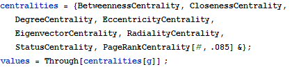
Ahora usamos un método de red social llamado BetweennessCentrality que mide la centralidad de un agente en una red. Es la fracción de las rutas más cortas entre pares de otros agentes que pasan a través de ese agente. Dado que el actor puede intermediar información entre los otros agentes, por ejemplo, esta medida se vuelve clave para determinar la importancia de un nodo particular en la red midiendo cómo se encuentra un nodo entre pares de actores sin nada que se encuentre entre un nodo y otros actores.
Primero crearemos una función que nos permitirá visualizar no solo BetweennessCentrality, sino también EigenvectorCentrality y ClosenessCentrality.


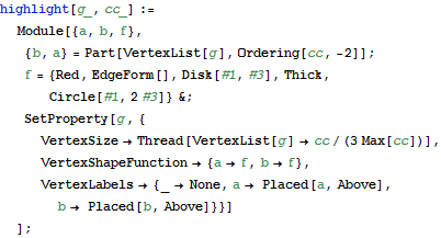
Comenzamos con un breve código para BetweennessCentrality que utiliza la función ColorData definida para mostrarnos qué actores tienen la mayor capacidad para transmitir recursos o información a través de la red, junto con la información sobre herramientas que se definió previamente.


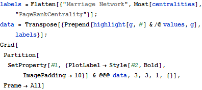
Y he aquí, Paul Revere parece tener una puntuación de interinidad mucho más alta que cualquier otra persona en la red. Significativamente, John Adams está en el centro de nuestro gráfico radial, pero no parece tener mucho poder en la red. Tomemos los números.


Revere tiene casi el doble del puntaje del siguiente colono más alto, Thomas Urann. Lo que esto indica es la importancia esencial de Revere en la red como intermediario de información. Como él es miembro de cinco de los siete grupos, esto no es terriblemente sorprendente, pero de lo contrario hubiera pasado desapercibido sin este tipo de investigación.
La cercanía La centralidad varía de la intermedia en que nos preocupamos por la longitud de la ruta a otros actores. Estos agentes que pueden llegar a un gran número de otros actores a través de trayectos cortos pueden diseminar información o incluso ejercer el poder de manera más eficiente que los agentes en la periferia de la red. Ejecutamos nuevamente nuestra función en la red y miremos a ClosenessCentrality para ver si Revere todavía se encuentra en la posición más alta.


Revere aparece clasificado como el más alto, pero no es tan dramático como su puntaje de intermediación y, de nuevo, John Adams tiene un puntaje bajo. Tomemos las medidas para un análisis posterior.


Como indica nuestra coloración del mapa de calor de los nodos, otros colonos no se quedan atrás de Revere, aunque sin duda es el mejor clasificado. Si bien hay otras personas importantes en la red, Revere es claramente el intermediario más eficiente de recursos, poder o información.
Una medida final que podemos examinar es EigenvectorCentrality,, que utiliza un algoritmo más avanzado y tiene en cuenta la centralidad de todos los nodos y la cercanía e incrustación de un actor individual entre los agentes altamente centrales.


Parece haber dos contendientes principales para la puntuación más alta del vector propio. Volvamos a calcular las medidas en una tabla para su examen.


Nathaniel Barber y Revere tienen puntajes casi idénticos; sin embargo, Revere todavía encabeza la lista. Tomemos ahora los cinco primeros puntajes de cercanía y creemos una red sin ellos para ver cómo podría cambiar la cohesión de la red.
.


Vemos un cambio bastante dramático en el gráfico de la izquierda con nuestros jugadores clave eliminados, lo que indica que aquellos con los cinco primeros puntajes de cercanía son bastante esenciales para unirse a estas siete organizaciones políticas juntas. Joseph Warren parece ser una de las pocas personas que puede actuar como un puente entre grupos dispares de conexiones. Básicamente, sería difícil que la información se distribuyera libremente a través de la red de la izquierda en oposición a la red de la derecha que incluye a Paul Revere.

Conclusión

Como hemos visto, podemos usar la ciencia de redes en la historia para descubrir o exponer ideas preconcebidas sobre la importancia de una figura en eventos históricos, según los metadatos de membresía grupal. Antes del análisis de Fischer, muchos pensaban que Revere era solo un mensajero, y no una figura importante. Sin embargo, lo que he podido mostrar es la importancia de Revere para unir grupos políticos dispares. Esto revela aún más que el movimiento Revolucionario fue pluralista en sus objetivos. En última instancia, la red estuvo unida por el desdén por la tiranía del rey Jorge III, las injustas acciones militares británicas y las políticas que llevaron a una sangrienta revuelta, no necesariamente una directiva descendente de las elites políticas.
Más allá de la historia, la ciencia de la red y el procesamiento del lenguaje natural tienen muchas aplicaciones, como descubrir agentes de información, recursos y poder, es decir, capital social ocultos. Uno puede imaginar fácilmente cómo esto podría ser útil para el marketing computacional o las relaciones públicas.
¿Cómo utilizará la ciencia de la red para descubrir ideas ocultas que de otra manera revolucionarán e interrumpirán su trabajo o sus intereses?

miércoles, 29 de octubre de 2014

Mathematica analiza magistralmente tu Facebook

Una herramienta magnífico le mostrará cómo utiliza Facebook como usted nunca ha visto antes 

WALTER HICKEY - Business Insider

Una de las cosas más divertidas acerca de Facebook es que se le permite ver a grupos de amigos desde una perspectiva imparcial digital.

Desafortunadamente, hasta ahora las personas que ofrecen los análisis de Facebook han sido, en general, vendedores de aceite de serpiente, lo que obligó a instalar una aplicación engorrosa o uno que se auto-publicar un anuncio.

Por suerte, Wolfram Alpha tiene su propia herramienta de análisis de Facebook y es magnífica.

Wolfram Alpha - un sitio que fue creado por Stephen Wolfram, el creador del muy importante software Mathematica - es el estándar de oro cuando se trata de cálculo en el Internet, así que no es sorpresa que su analizador de Facebook es impresionante.

Aquí están algunas de las mejores cosas que he aprendido de mi página de correr a través del servicio.

Analice su propio perfil aquí

He estado publicando muchos más enlaces desde que he trabajado para Business Insider.


Wolfram Alpha

Esto fue realmente genial. Tiendo a publicar actualizaciones de estado más adelante en el día, pero los enlaces durante la jornada de trabajo de 9 a 5.


Wolfram Alpha

Tiendo a publicar estados cortos y medios 8.6 "Me gusta" por mensaje.


Wolfram Alpha


Yo no uso el iPhone Facebook o aplicación Android mucho.


Wolfram Alpha

Cuando empezamos a buscar a mis amigos, que tiene mucho más interesante. Me preguntaba por qué no había un sesgo masculino en el perfil de género hasta que me di cuenta de que va a una escuela secundaria católica de varones podría causar tal cambio.


Wolfram Alpha

Un par de mis amigos están en todo el mundo en este momento. Conozco a algunos que están haciendo la investigación o servicio en el extranjero.


Wolfram Alpha

La identificación de las mariposas sociales aquí. Un grupo de estas personas se postuló para el gobierno estudiantil, por lo que esta esencia tiene sentido. La mayoría de las personas que conozco tienen entre 400 y 1.000 amigos en Facebook.


Wolfram Alpha

Aquí está la joya de la corona del análisis Wolfram Alpha Facebook. Este es un gráfico que muestra todas las conexiones entre mis amigos.


Wolfram Alpha

No es súper interesante a menos que tenga sentido, y yo era capaz de discernir un montón de cosas interesantes sobre la base de que estaba en cada grupo:


Wolfram Alpha

Mirando aún más profundo, se puede ver aún más sub-grupos y por qué ciertas personas se encuentran en ciertos lugares. También tuve la oportunidad de ver por qué los valores extremos sin conexiones eran así.


Wolfram Alpha

Cuando miramos sólo el hombre - recuerdo que fui a una escuela secundaria de varones - algo aún más frío que pasa con las nuevas averías en grupo.


martes, 8 de julio de 2014

Mathematica visualiza redes online

Las comunidades de Redes de Amigos en Facebook con Mathematica 

La comunidades como la familia, compañeros de trabajo y amigos de la secundaria en Facebook redes de amigos pueden ser detectados y visualizados en Mathematica 9.

In[1]:=
Click for copyable input

Out[1]=


Wolfram

domingo, 6 de julio de 2014

Centralidad y prestigio en los datos de Padgett usando Mathematica

Centralidad y prestigio de las familias florentinas 

La familia Medici no tenía la mayor riqueza o la mayoría de escaños en la legislatura, sin embargo, llegó al poder. A través de los matrimonios, la familia Medici tenía una posición de centralidad en la red social, que es crucial para la comunicación, ofertas de intermediación, etc


In[1]:=
Click for copyable input
In[2]:=
Click for copyable input
In[3]:=
Click for copyable input
In[4]:=
Click for copyable input


Wolfram

miércoles, 8 de mayo de 2013

Datos científicos de Facebook gracias a Wolfram

Data Science of the Facebook World

April 24, 2013

More than a million people have now used our Wolfram|Alpha Personal Analytics for Facebook. And as part of our latest update, in addition to collecting some anonymized statistics, we launched a Data Donor program that allows people to contribute detailed data to us for research purposes.
A few weeks ago we decided to start analyzing all this data. And I have to say that if nothing else it’s been a terrific example of the power of Mathematica and the Wolfram Language for doing data science. (It’ll also be good fodder for the Data Science course I’m starting to create.)
We’d always planned to use the data we collect to enhance our Personal Analyticssystem. But I couldn’t resist also trying to do some basic science with it.
I’ve always been interested in people and the trajectories of their lives. But I’ve never been able to combine that with my interest in science. Until now. And it’s been quite a thrill over the past few weeks to see the results we’ve been able to get. Sometimes confirming impressions I’ve had; sometimes showing things I never would have guessed. And all along reminding me of phenomena I’ve studied scientifically in A New Kind of Science.
So what does the data look like? Here are the social networks of a few Data Donors—with clusters of friends given different colors. (Anyone can find their own network using Wolfram|Alpha—or the SocialMediaData function inMathematica.)

So a first quantitative question to ask is: How big are these networks usually? In other words, how many friends do people typically have on Facebook? Well, at least for our users, that’s easy to answer. The median is 342—and here’s a histogram showing the distribution (there’s a cutoff at 5000 because that’s the maximum number of friends for a personal Facebook page):
distribution of number of friends for our users
But how typical are our users? In most respects—so far as we can tell—they seem pretty typical. But there are definitely some differences. Like here’s the distribution of the number of friends not just for our users, but also for their friends (there’s a mathematical subtlety in deriving this that I’ll discuss later):
distribution of number of friends for users+friends
And what we see is that in this broader Facebook population, there are significantly more people who have almost no Facebook friends. Whether such people should be included in samples one takes is a matter of debate. But so long as one looks at appropriate comparisons, aggregates, and so on, they don’t seem to have a huge effect. (The spike at 200 friends probably has to do with Facebook’s friend recommendation system.)
So, OK. Let’s ask for example how the typical number of Facebook friends varies with a person’s age. Of course all we know are self-reported “Facebook ages”. But let’s plot how the number of friends varies with that age. The solid line is the median number of friends; successive bands show successive octiles of the distribution.
number of friends vs. age
After a rapid rise, the number of friends peaks for people in their late teenage years, and then declines thereafter. Why is this? I suspect it’s partly a reflection of people’s intrinsic behavior, and partly a reflection of the fact that Facebook hasn’t yet been around very long. Assuming people don’t drop friends much once they’ve added them one might expect that the number of friends would simply grow with age. And for sufficiently young people that’s basically what we see. But there’s a limit to the growth, because there’s a limit to the number of years people have been on Facebook. And assuming that’s roughly constant across ages, what the plot suggests is that people add friends progressively more slowly with age.
But what friends do they add? Given a person of a particular age, we can for example ask what the distribution of ages of the person’s friends is. Here are some results (the jaggedness, particularly at age 70, comes from the limited data we have):
friend ages for people of different ages
And here’s an interactive version, generated from CDF:

The first thing we see is that the ages of friends always peak at or near the age of the person themselves—which is presumably a reflection of the fact that in today’s society many friends are made in age-based classes in school or college. For younger people, the peak around the person’s age tends to be pretty sharp. For older people, the distribution gets progressively broader.
We can summarize what happens by plotting the distribution of friend ages against the age of a person (the solid line is the median age of friends):
median age of friends vs. age
There’s an anomaly for the youngest ages, presumably because of kids under 13 misreporting their ages. But apart from that, we see that young people tend to have friends who are remarkably close in age to themselves. The broadening as people get older is probably associated with people making non-age-related friends in their workplaces and communities. And as the array of plots above suggests, by people’s mid-40s, there start to be secondary peaks at younger ages, presumably as people’s children become teenagers, and start using Facebook.
So what else can one see about the trajectory of people’s lives? Here’s the breakdown according to reported relationship status as a function of age:
relationship status fractions vs. age
And here’s more detail, separating out fractions for males and females (“married+” means “civil union”, “separated”, “widowed”, etc. as well as “married”):
relationship status fractions vs. age
There’s some obvious goofiness at low ages with kids (slightly more often girls than boys) misreporting themselves as married. But in general the trend is clear. The rate of getting married starts going up in the early 20s—a couple of years earlier for women than for men—and decreases again in the late 30s, with about 70% of people by then being married. The fraction of people “in a relationship” peaks around age 24, and there’s a small “engaged” peak around 27. The fraction of people who report themselves as married continues to increase roughly linearly with age, gaining about 5% between age 40 and age 60—while the fraction of people who report themselves as single continues to increase for women, while decreasing for men.
I have to say that as I look at the plots above, I’m struck by their similarity to plots for physical processes like chemical reactions. It’s as if all those humans, with all the complexities of their lives, still behave in aggregate a bit like molecules—with certain “reaction rates” to enter into relationships, marry, etc.
Of course, what we’re seeing here is just for the “Facebook world”. So how does it compare to the world at large? Well, at least some of what we can measure in the Facebook world is also measured in official censuses. And so for example we can see how our results for the fraction of people married at a given age compare with results from the official US Census:
fraction married vs. age
I’m amazed at how close the correspondence is. Though there are clearly some differences. Like below age 20 kids on Facebook are misreporting themselves as married. And on the older end, widows are still considering themselves married for purposes of Facebook. For people in their 20s, there’s also a small systematic difference—with people on Facebook on average getting married a couple of years later than the Census would suggest. (As one might expect, if one excludes the rural US population, the difference gets significantly smaller.)
Talking of the Census, we can ask in general how our Facebook population compares to the US population. And for example, we find, not surprisingly, that our Facebook population is heavily weighted toward younger people:
population vs. age
OK. So we saw above how the typical number of friends a person has depends on age. What about gender? Perhaps surprisingly, if we look at all males and all females, there isn’t a perceptible difference in the distributions of number of friends. But if we instead look at males and females as a function of age, there is a definite difference:
number of friends vs. age
Teenage boys tend to have more friends than teenage girls, perhaps because they are less selective in who they accept as friends. But after the early 20s, the difference between genders rapidly dwindles.
What effect does relationship status have? Here’s the male and female data as a function of age:
median number of friends vs. age
In the older set, relationship status doesn’t seem to make much difference. But for young people it does. With teenagers who (mis)report themselves as “married” on average having more friends than those who don’t. And with early teenage girls who say they’re “engaged” (perhaps to be able to tag a BFF) typically having more friends than those who say they’re single, or just “in a relationship”.
Another thing that’s fairly reliably reported by Facebook users is location. And it’s common to see quite a lot of variation by location. Like here are comparisons of the median number of friends for countries around the world (ones without enough data are left gray), and for states in the US:
median number of friends by location
There are some curious effects. Countries like Russia and China have low median friend counts because Facebook isn’t widely used for connections between people inside those countries. And perhaps there are lower friend counts in the western US because of lower population densities. But quite why there are higher friend counts for our Facebook population in places like Iceland, Brazil and the Philippines—or Mississippi—I don’t know. (There is of course some “noise” from people misreporting their locations. But with the size of the sample we have, I don’t think this is a big effect.)
In Facebook, people can list both a “hometown” and a “current city”. Here’s how the probability that these are in the same US state varies with age:
percentage who moved states vs. age
What we see is pretty much what one would expect. For some fraction of the population, there’s a certain rate of random moving, visible here for young ages. Around age 18, there’s a jump as people move away from their “hometowns” to go to college and so on. Later, some fraction move back, and progressively consider wherever they live to be their “hometown”.
One can ask where people move to and from. Here’s a plot showing the number of people in our Facebook population moving between different US states, and different countries:
migration between US states
migration between countries
There’s a huge range of demographic questions we could ask. But let’s come back to social networks. It’s a common observation that people tend to be friends with people who are like them. So to test this we might for example ask whether people with more friends tend to have friends who have more friends. Here’s a plot of the median number of friends that our users have, as a function of the number of friends that they themselves have: median friend count vs. friend count
And the result is that, yes, on average people with more friends tend to have friends with more friends. Though we also notice that people with lots of friends tend to have friends with fewer friends than themselves.
And seeing this gives me an opportunity to discuss a subtlety I alluded to earlier. The very first plot in this post shows the distribution of the number of friends that our users have. But what about the number of friends that their friends have? If we just average over all the friends of all our users, this is how what we get compares to the original distribution for our users themselves:
distribution of number of friends
It seems like our users’ friends always tend to have more friends than our users themselves. But actually from the previous plot we know this isn’t true. So what’s going on? It’s a slightly subtle but general social-network phenomenon known as the “friendship paradox”. The issue is that when we sample the friends of our users, we’re inevitably sampling the space of all Facebook users in a very non-uniform way. In particular, if our users represent a uniform sample, any given friend will be sampled at a rate proportional to how many friends they have—with the result that people with more friends are sampled more often, so the average friend count goes up.
It’s perfectly possible to correct for this effect by weighting friends in inverse proportion to the number of friends they have—and that’s what we did earlier in this post. And by doing this we determine that in fact the friends of our users do not typically have more friends than our users themselves; instead their median number of friends is actually 229 instead of 342.
It’s worth mentioning that if we look at the distribution of number of friends that we deduce for the Facebook population, it’s a pretty good fit to a power law, with exponent -2.8. And this is a common form for networks of many kinds—which can be understood as the result of an effect known as “preferential attachment”, in which as the network grows, nodes that already have many connections preferentially get more connections, leading to a limiting “scale-free network” with power-law features.
But, OK. Let’s look in more detail at the social network of an individual user. I’m not sufficiently diligent on Facebook for my own network to be interesting. But my 15-year-old daughter Catherine was kind enough to let me show her network:
social network
There’s a dot for each of Catherine’s Facebook friends, with connections between them showing who’s friends with whom. (There’s no dot for Catherine herself, because she’d just be connected to every other dot.) The network is laid out to show clusters or “communities” of friends (using the Wolfram Language functionFindGraphCommunities). And it’s amazing the extent to which the network “tells a story”. With each cluster corresponding to some piece of Catherine’s life or history.
Here’s a whole collection of networks from our Data Donors:
social networks
No doubt each of these networks tells a different story. But we can still generate overall statistics. Like, for example, here is a plot of how the number of clusters of friends varies with age (there’d be less noise if we had more data):
mean number of clusters vs. age
Even at age 13, people typically seem to have about 3 clusters (perhaps school, family and neighborhood). As they get older, go to different schools, take jobs, and so on, they accumulate another cluster or so. Right now the number saturates above about age 30, probably in large part just because of the limited time Facebook has been around.
How big are typical clusters? The largest one is usually around 100 friends; the plot below shows the variation of this size with age:
median size of largest cluster vs. age
And here’s how the size of the largest cluster as a fraction of the whole network varies with age:
relative size of largest cluster vs. age
What about more detailed properties of networks? Is there a kind of “periodic table” of network structures? Or a classification scheme like the one I made long ago for cellular automata?
The first step is to find some kind of iconic summary of each network, which we can do for example by looking at the overall connectivity of clusters, ignoring their substructure. And so, for example, for Catherine (who happened to suggest this idea), this reduces her network to the following “cluster diagram”:
cluster diagram of social network
Doing the same thing for the Data Donor networks shown above, here’s what we get:
mini social networks
In making these diagrams, we’re keeping every cluster with at least 2 friends. But to get a better overall view, we can just drop any cluster with, say, less than 10% of all friends—in which case for example Catherine’s cluster diagram becomes just:
cluster diagram after clusters with less than 10% of friends were dropped
And now for example we can count the relative numbers of different types of structures that appear in all the Data Donor networks:
Bar chart of different types of clustered social networks
And we can look at how the fractions of each of these structures vary with age:
community graph makeup vs. age
What do we learn? The most common structures consist of either two or three major clusters, all of them connected. But there are also structures in which major clusters are completely disconnected—presumably reflecting facets of a person’s life that for reasons of geography or content are also completely disconnected.
For everyone there’ll be a different detailed story behind the structure of their cluster diagram. And one might think this would mean that there could never be a general theory of such things. At some level it’s a bit like trying to find a general theory of human history, or a general theory of the progression of biological evolution. But what’s interesting now about the Facebook world is that it gives us so much more data from which to form theories.
And we don’t just have to look at things like cluster diagrams, or even friend networks: we can dig almost arbitrarily deep. For example, we can analyze the aggregated text of posts people make on their Facebook walls, say classifying them by topics they talk about (this uses a natural-language classifier written in the Wolfram Language and trained using some large corpora):
topics discussed on Facebook
Each of these topics is characterized by certain words that appear with high frequency:
word clouds for topics discussed on Facebook
And for each topic we can analyze how its popularity varies with (Facebook) age:
topics discussed on Facebook
It’s almost shocking how much this tells us about the evolution of people’s typical interests. People talk less about video games as they get older, and more about politics and the weather. Men typically talk more about sports and technology than women—and, somewhat surprisingly to me, they also talk more about movies, television and music. Women talk more about pets+animals, family+friends, relationships—and, at least after they reach child-bearing years, health. The peak time for anyone to talk about school+university is (not surprisingly) around age 20. People get less interested in talking about “special occasions” (mostly birthdays) through their teens, but gradually gain interest later. And people get progressively more interested in talking about career+money in their 20s. And so on. And so on.
Some of this is rather depressingly stereotypical. And most of it isn’t terribly surprising to anyone who’s known a reasonable diversity of people of different ages. But what to me is remarkable is how we can see everything laid out in such quantitative detail in the pictures above—kind of a signature of people’s thinking as they go through life.
Of course, the pictures above are all based on aggregate data, carefully anonymized. But if we start looking at individuals, we’ll see all sorts of other interesting things. And for example personally I’m very curious to analyze my own archive of nearly 25 years of email—and then perhaps predict things about myself by comparing to what happens in the general population.
Over the decades I’ve been steadily accumulating countless anecdotal “case studies” about the trajectories of people’s lives—from which I’ve certainly noticed lots of general patterns. But what’s amazed me about what we’ve done over the past few weeks is how much systematic information it’s been possible to get all at once. Quite what it all means, and what kind of general theories we can construct from it, I don’t yet know.
But it feels like we’re starting to be able to train a serious “computational telescope” on the “social universe”. And it’s letting us discover all sorts of phenomena. That have the potential to help us understand much more about society and about ourselves. And that, by the way, provide great examples of what can be achieved with data science, and with the technology I’ve been working on developing for so long.