Visualising Twitter Friend Connections Using Gephi: An Example Using the @WiredUK Friends Network
To corrupt a well known saying, “cook a man a meal and he’ll eat it; teach a man a recipe, and maybe he’ll cook for you…”, I thought it was probably about time I posted the recipe I’ve been using for laying out Twitter friends networks using Gephi, not least because I’ve been generating quite a few network files for folk lately, giving them copies, and then not having a tutorial to point them to. So here’s that tutorial…
The starting point is actually quite a long way down the “how did you that?” chain, but I have to start somewhere, and the middle’s easier than the beginning, so that’s where we’ll step in (I’ll give some clues as to how the beginning works at the end…;-)
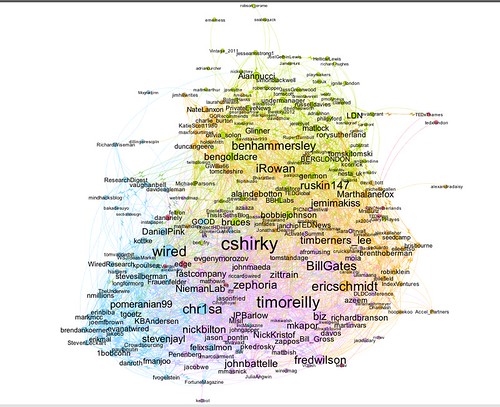
Here’s what we’ll be working towards: a diagram that shows how the people on Twitter that @wiredUK follows follow each other:
The tool we’re going to use to layout this graph from a data file is a free, extensible, open source, cross platform Java based tool called Gephi . If you want to play along, download the datafile . (Or try with a network of your own, such as your Facebook network or social data grabbed from Google+.)
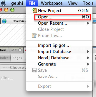
From the Gephi file menu, Open the appropriate graph file:
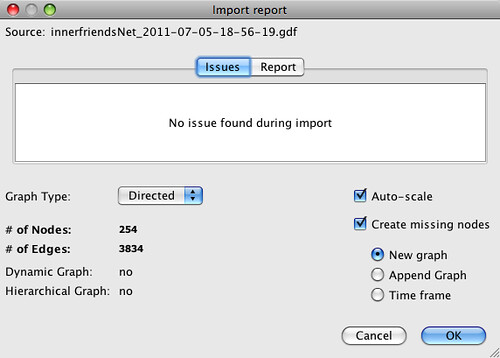
Import the file as a Directed Graph:
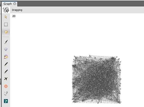
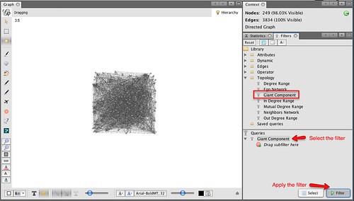
The Graph window displays the graph in a raw form:
Sometimes a graph may contain nodes that are not connected to any other nodes. (For example, protected Twitter accounts do not publish – and are not published in – friends or followers lists publicly via the Twitter API.) Some layout algorithms may push unconnected nodes far away from the rest of the graph, which can affect generation of presentation views of the network, so we need to filter out these unconnected nodes. The easiest way of doing this is to filter the graph using the Giant Component filter.
To colour the graph, I often make us of the modularity statistic. This algorithm attempts to find clusters in the graph by identifying components that are highly interconnected.
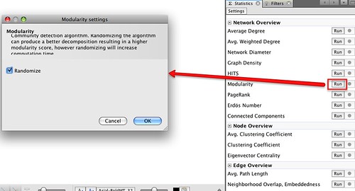
This algorithm is a random one, so it’s often worth running it several times to see how many communities typically get identified.
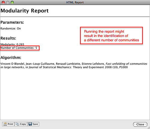
A brief report is displayed after running the statistic:
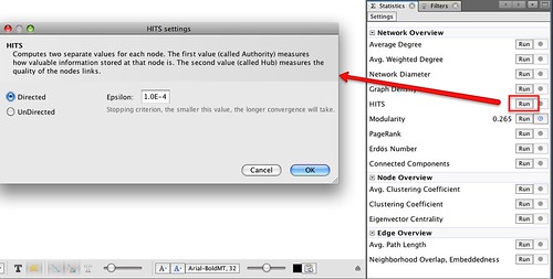
While we have the Statistics panel open, we can take the opportunity to run another measure: the HITS algorithm. This generates the well known Authority and Hub values which we can use to size nodes in the graph.
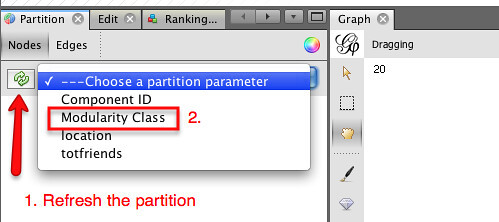
The next step is to actually colour the graph. In the Partition panel, refresh the partition options list and then select Modularity Class.
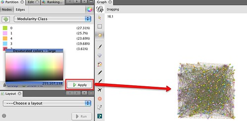
Choose appropriate colours (right click on each colour panel to select an appropriate colour for each class – I often select pastel colours) and apply them to the graph.
The next thing we want to do is lay out the graph. The Layout panel contains several different layout algorithms that can be used to support the visual analysis of the structures inherent in the network; (try some of them – each works in a slightly different way; some are also better than others for coping with large networks). For a network this size and this densely connected,I’d typically start out with one of the force directed layouts, that positions nodes according to how tightly linked they are to each other.
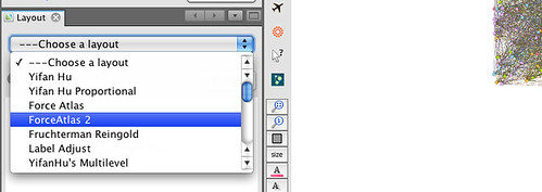
When you select the layout type, you will notice there are several parameters you can play with. The default set is often a good place to start…
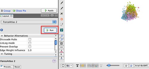
Run the layout tool and you should see the network start to lay itself out. Some algorithms require you to actually Stop the layout algorithm; others terminate themselves according to a stopping criterion, or because they are a “one-shot” application (such as the Expansion algorithm, which just scales the x and y values by a given factor).
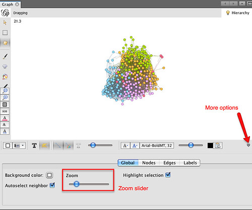
We can zoom in and out on the layout of the graph using a mouse wheel (on my MacBook trackpad, I use a two finger slide up and down), or use the zoom slider from the “More options” tab:
To see which Twitter ID each node corresponds to, we can turn on the labels:
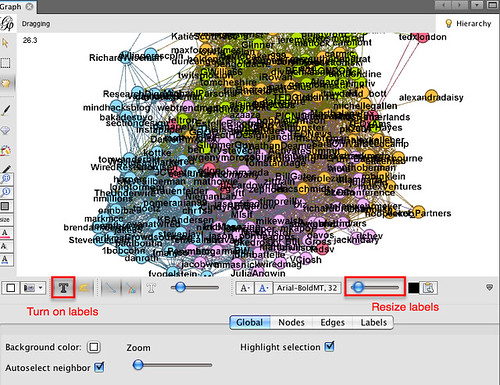
This view is very cluttered – the nodes are too close to each other to see what’s going on. The labels and the nodes are also all the same size, giving the same visual weight to each node and each label. One thing I like to do is resize the nodes relative to some property, and then scale the label size to be proportional to the node size.
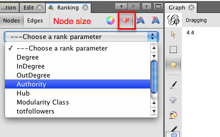
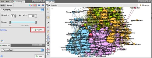
Here’s how we can scale the node size and then set the text label size to be proportional to node size. In the Ranking panel, select the node size property, and the attribute you want to make the size proportional to. I’m going to use Authority, which is a network property that we calculated when we ran the HITS algorithm. Essentially, it’s a measure of how well linked to a node is.
The min size/max size slider lets us define the minimum and maximum node sizes. By default, a linear mapping from attribute value to size is used, but the spline option lets us use a non-linear mappings.
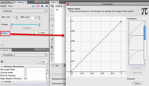
I’m going with the default linear mapping…
We can now scale the labels according to node size:
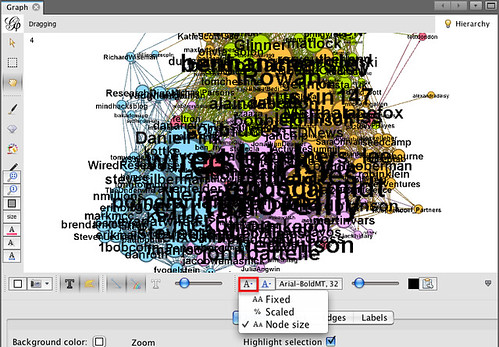
Note that you can continue to use the text size slider to scale the size of all the displayed labels together.
This diagram is now looking quite cluttered – to make it easier to read, it would be good if we could spread it out a bit. The Expansion layout algorithm can help us do this:
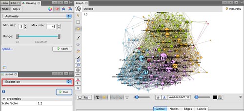
A couple of other layout algorithms that are often useful: the Transformation layout algorithm lets us scale the x and y axes independently (compared to the Expansion algorithm, which scales both axes by the same amount); and the Clockwise Rotate and Counter-Clockwise Rotate algorithm lets us rotate the whole layout (this can be useful if you want to rotate the graph so that it fits neatly into a landscape view.
The expanded layout is far easier to read, but some of the labels still overlap. The Label Adjust layout tool can jiggle the nodes so that they don’t overlap.
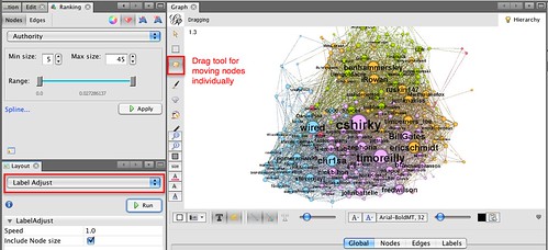
(Note that you can also move individual nodes by clicking on them and dragging them.)
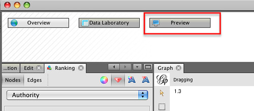
So – nearly there… The final push is to generate a good quality output. We can do this from the preview window:
The preview window is where we can generate good quality SVG renderings of the graph. The node size, colour and scaled label sizes are determined in the original Overview area (the one we were working in), although additional customisations are possible in the Preview area.
To render our graph, I just want to make a couple of tweaks to the original Default preview settings: Show Labels and set the base font size.
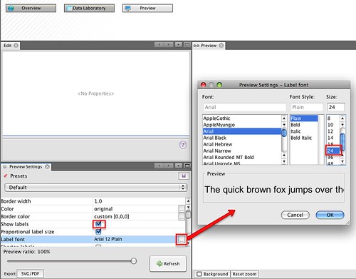
Click on the Refresh button to render the graph:
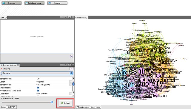
Oops – I overdid the font size… let’s try again:
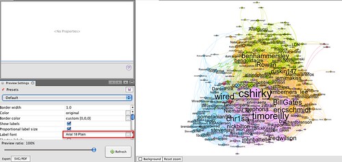
Okay – so that’s a good start. Now I find I often enter into a dance between the Preview ad Overview panels, tweaking the layout until I get something I’m satisfied with, or at least, that’s half-way readable.
How to read the graph is another matter of course, though by using colour, sizing and placement, we can hopefully draw out in a visual way some interesting properties of the network. The recipe described above, for example, results in a view of the network that shows:
- groups of people who are tightly connected to each other, as identified by the modularity statistic and consequently group colour; this often defines different sorts of interest groups. (My follower network shows distinct groups of people from the Open University, and JISC, the HE library and educational technology sectors, UK opendata and data journalist types, for example.)
- people who are well connected in the graph, as displayed by node and label size.
- people who are well connected in the graph, as displayed by node and label size.
Here’s my final version of the @wiredUK “inner friends” network:
You can probably do better though…;-)
To recap, here’s the recipe again:
- filter on connected component (private accounts don’t disclose friend/follower detail to the api key i use) to give a connected graph;
- run the modularity statistic to identify clusters; sometimes I try several attempts
- colour by modularity class identified in previous step, often tweaking colours to use pastel tones
- I often use a force directed layout, then Expansion to spread to network out a bit if necessary; the Clockwise Rotate or Counter-Clockwise rotate will rotate the network view; I often try to get a landscape format; the Transformation layout lets you expand or contract the graph along a single axis, or both axes by different amounts.
- run HITS statistic and size nodes by authority
- size labels proportional to node size
- use label adjust and expand to to tweak the layout
- use preview with proportional labels to generate a nice output graph
- iterate previous two steps to a get a layout that is hopefully not completely unreadable…
Got that?!;-)
Finally, to the return beginning. The recipe I use to generate the data is as follows:
- grab a list of twitter IDs (call it L); there are several ways of doing this, for example: obtain a list of tweets on a particular topic by searching for a particular hashtag, then grab the set of unique IDs of people using the hashtag; grab the IDs of the members of one or more Twitter lists; grab the IDs of people following or followed by a particular person; grab the IDs of people sending geo-located tweets in a particular area;
- for each person P in L, add them as a node to a graph;
- for each person P in L, get a list of people followed by the corresponding person, e.g. Fr(P)
- for each X in e.g. Fr(P): if X in Fr(P) and X in L, create an edge [P,X] and add it to the graph
- save the graph in a format that can be visualised in Gephi.
To make this recipe, I use Tweepy and a Python script to call the Twitter API and get the friends lists from there, but you could use the Google Social API to get the same data. There’s an example of calling that API using Javscript in my “live” Twitter friends visualisation script (Using Protovis to Visualise Connections Between People Tweeting a Particular Term) as well as in the A Bit of NewsJam MoJo – SocialGeo Twitter Map.