A couple of weeks ago, I came across Gephi, a desktop application for visualising networks.
And quite by chance, a day or two after I was asked about any tools I knew of that could visualise and help analyse social network activity around an OU course… which I take as a reasonable justification for exploring exactly what Gephi can do :-)
So, after a few false starts, here’s what I’ve learned so far…
First up, we need to get some graph data – netvizz – facebook to gephi suggests that the netvizz facebook appcan be used to grab a copy of your Facebook network in a format that Gephi understands, so I installed the app, downloaded my network file, and then uninstalled the app… (can’t be too careful ;-)
Once Gephi is launched (and updated, if it’s a new download – you’ll see an updates prompt in the status bar along the bottom of the Gephi window, right hand side) Open… the network file you downloaded.
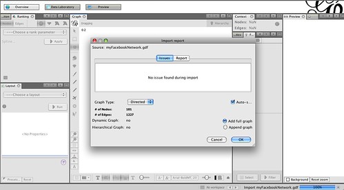
NB I think the graph should probably be loaded as an undirected graph… That is, if A connects to B, B connects to A. But I’m committed to the directed version in this case, so we’ll stick with it… (The directed version would make sense for a Twitter network (which has an asymmetric friending model), where A may follow B, but B might choose not to follow A. In Facebook, friending is symmetric – A can only friend B if B friends A.
(Btw, I’ve come across a few gotchas using Gephi so far, including losing the window layout shown above. Playing with the Reset Windows from the Windows menu sometimes helps… There may be an easier way, but I haven’t found it yet…)
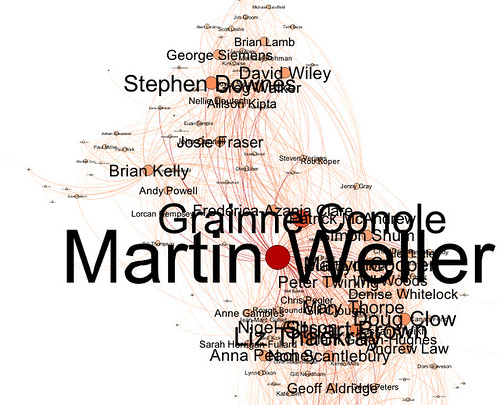
The graph window gives a preview of the network – in this case, the nodes are people and the edges show that one person is following another. (Remember, I should have loaded this as an undirected graph. The directed edges are just an artefact of the way the edge list that states who is connected to whom was generated by netvizz.)
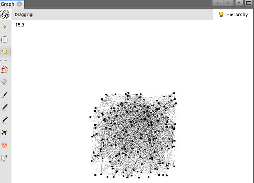
Using the scroll wheel on a mouse (or two finger push on my Mac mousepad), you can zoom in and out of the network in the graph view. You can also move nodes around, view the labels, switch the edges on and off off, and recenter the view.
Not shown – but possible – is deleting nodes from the graph, as well as editing their properties.
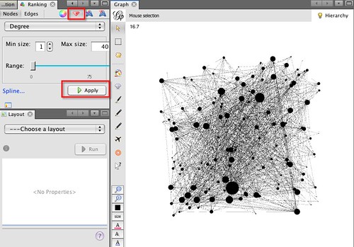
You can also generate views of the graph that show information about the network. In the Ranking panel, if you select the Nodes tab, set the option to Degree (the number of edges/connections attached to a node) and then choose the node size button (the jewel), you can set the size of the node to be proportional to the number of connections. Tune the min and max sizes as required, then hit apply:
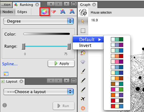
You can also colour the nodes according to properties:
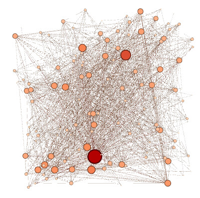
So for example, we might get something like this:
Label size and colour can also be proportional to node attributes:
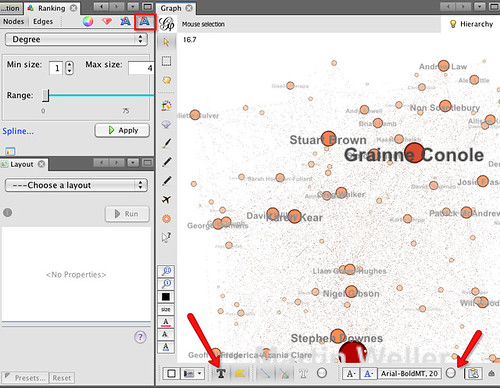
To view the labels, make sure you click on the Text labels option at the bottom of the graph panel. You may also need to tweak the label size slider that’s also on the bottom of the panel.
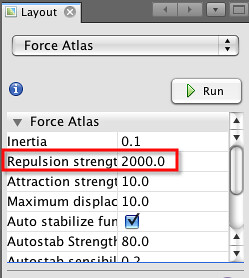
If you want to generate a pretty version of the graph, you need to do a couple of things. Firstly, in the layout panel, select a layout algorithm. Force Atlas is the one that the original tutorial recommends. The repulsion strength determines how dispersed the final graph will be (i.e. it sets the “repulsive force” between nodes); I set a value of 2000, but feel free to play:
When you hit Run, the button label will change to Stop and the graph should start to move and reorganise itself. Hit Stop when the graph looks a little better laid out. Remember, you can also move nodes around in the graph as show in the video above.
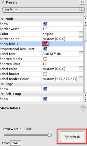
Having run the Layout routine, we can now generate a pretty view of the graph. In the Preview Settings panel on the left-hand side of the Gephi environment, select “Show Labels” and then hit “Refresh”:
In the Preview panel, (next tab along from Preview Settings), you should see a the prettified, 3D layout view:
Note that in this case I haven’t made much attempt at generating a nice layout, for example by moving nodes around in the graph window to better position them, but you can do… (just remember to Refresh the Preview view in the Preview Settings… (There must be a shortcut way of doing that, but I haven’t found it…!:-(
If you want to look at who any particular individual is connected to, you can go to the
Data Table panel (again in the set of panels on the right hand side, just along from the Preview tab panel) and search for people by name. Here, I’m searching the edges to see who of my Facebook friends a certain Martin W is also connected to on Facebook;
Data Table panel (again in the set of panels on the right hand side, just along from the Preview tab panel) and search for people by name. Here, I’m searching the edges to see who of my Facebook friends a certain Martin W is also connected to on Facebook;
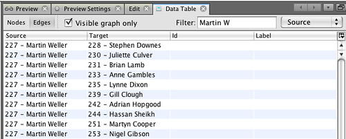
It’s easy enough to highlight/select and copy these cells and then post them into a spreadsheet if required.
So that’s step 1 of getting started with Gephi… a way of using it to explore a graph in very general terms; but that’s not where the real fun lies. That starts when you start processing the graph by running statistics and filters over it. But for that, you’ll have to wait for the next post in this series… which is here: Getting Started With Gephi Network Visualisation App – My Facebook Network, Part II: Basic Filters
Ouseful.info