A few weeks ago we decided to
start analyzing all this data. And I have to say that if nothing else it’s been a terrific example of the power of
Mathematica and the Wolfram Language for doing data science. (It’ll also be good fodder for the Data Science course I’m starting to create.)
We’d always planned to use the data we collect to enhance our
Personal Analyticssystem. But I couldn’t resist also trying to do some basic science with it.
I’ve always been interested in people and the trajectories of their lives. But I’ve never been able to combine that with my interest in science. Until now. And it’s been quite a thrill over the past few weeks to see the results we’ve been able to get. Sometimes confirming impressions I’ve had; sometimes showing things I never would have guessed. And all along reminding me of phenomena I’ve studied scientifically in
A New Kind of Science.
So what does the data look like? Here are the social networks of a few Data Donors—with clusters of friends given different colors. (Anyone can find their own network using
Wolfram|Alpha—or the
SocialMediaData function in
Mathematica.)
So a first quantitative question to ask is: How big are these networks usually? In other words, how many friends do people typically have on Facebook? Well, at least for our users, that’s easy to answer. The median is 342—and here’s a histogram showing the distribution (there’s a cutoff at 5000 because that’s the maximum number of friends for a personal Facebook page):
But how typical are our users? In most respects—so far as we can tell—they seem pretty typical. But there are definitely some differences. Like here’s the distribution of the number of friends not just for our users, but also for their friends (there’s a mathematical subtlety in deriving this that I’ll discuss later):
And what we see is that in this broader Facebook population, there are significantly more people who have almost no Facebook friends. Whether such people should be included in samples one takes is a matter of debate. But so long as one looks at appropriate comparisons, aggregates, and so on, they don’t seem to have a huge effect. (The spike at 200 friends probably has to do with Facebook’s friend recommendation system.)
So, OK. Let’s ask for example how the typical number of Facebook friends varies with a person’s age. Of course all we know are self-reported “Facebook ages”. But let’s plot how the number of friends varies with that age. The solid line is the median number of friends; successive bands show successive octiles of the distribution.

After a rapid rise, the number of friends peaks for people in their late teenage years, and then declines thereafter. Why is this? I suspect it’s partly a reflection of people’s intrinsic behavior, and partly a reflection of the fact that Facebook hasn’t yet been around very long. Assuming people don’t drop friends much once they’ve added them one might expect that the number of friends would simply grow with age. And for sufficiently young people that’s basically what we see. But there’s a limit to the growth, because there’s a limit to the number of years people have been on Facebook. And assuming that’s roughly constant across ages, what the plot suggests is that people add friends progressively more slowly with age.
But what friends do they add? Given a person of a particular age, we can for example ask what the distribution of ages of the person’s friends is. Here are some results (the jaggedness, particularly at age 70, comes from the limited data we have):
And here’s an interactive version, generated from
CDF:
The first thing we see is that the ages of friends always peak at or near the age of the person themselves—which is presumably a reflection of the fact that in today’s society many friends are made in age-based classes in school or college. For younger people, the peak around the person’s age tends to be pretty sharp. For older people, the distribution gets progressively broader.
We can summarize what happens by plotting the distribution of friend ages against the age of a person (the solid line is the median age of friends):
There’s an anomaly for the youngest ages, presumably because of kids under 13 misreporting their ages. But apart from that, we see that young people tend to have friends who are remarkably close in age to themselves. The broadening as people get older is probably associated with people making non-age-related friends in their workplaces and communities. And as the array of plots above suggests, by people’s mid-40s, there start to be secondary peaks at younger ages, presumably as people’s children become teenagers, and start using Facebook.
So what else can one see about the trajectory of people’s lives? Here’s the breakdown according to reported relationship status as a function of age:
And here’s more detail, separating out fractions for males and females (“married+” means “civil union”, “separated”, “widowed”, etc. as well as “married”):
There’s some obvious goofiness at low ages with kids (slightly more often girls than boys) misreporting themselves as married. But in general the trend is clear. The rate of getting married starts going up in the early 20s—a couple of years earlier for women than for men—and decreases again in the late 30s, with about 70% of people by then being married. The fraction of people “in a relationship” peaks around age 24, and there’s a small “engaged” peak around 27. The fraction of people who report themselves as married continues to increase roughly linearly with age, gaining about 5% between age 40 and age 60—while the fraction of people who report themselves as single continues to increase for women, while decreasing for men.
I have to say that as I look at the plots above, I’m struck by their similarity to plots for physical processes like chemical reactions. It’s as if all those humans, with all the complexities of their lives, still behave in aggregate a bit like molecules—with certain “reaction rates” to enter into relationships, marry, etc.
Of course, what we’re seeing here is just for the “Facebook world”. So how does it compare to the world at large? Well, at least some of what we can measure in the Facebook world is also measured in official censuses. And so for example we can see how our results for the fraction of people married at a given age compare with results from the official US Census:
I’m amazed at how close the correspondence is. Though there are clearly some differences. Like below age 20 kids on Facebook are misreporting themselves as married. And on the older end, widows are still considering themselves married for purposes of Facebook. For people in their 20s, there’s also a small systematic difference—with people on Facebook on average getting married a couple of years later than the Census would suggest. (As one might expect, if one excludes the rural US population, the difference gets significantly smaller.)
Talking of the Census, we can ask in general how our Facebook population compares to the US population. And for example, we find, not surprisingly, that our Facebook population is heavily weighted toward younger people:
OK. So we saw above how the typical number of friends a person has depends on age. What about gender? Perhaps surprisingly, if we look at all males and all females, there isn’t a perceptible difference in the distributions of number of friends. But if we instead look at males and females as a function of age, there is a definite difference:
Teenage boys tend to have more friends than teenage girls, perhaps because they are less selective in who they accept as friends. But after the early 20s, the difference between genders rapidly dwindles.
What effect does relationship status have? Here’s the male and female data as a function of age:
In the older set, relationship status doesn’t seem to make much difference. But for young people it does. With teenagers who (mis)report themselves as “married” on average having more friends than those who don’t. And with early teenage girls who say they’re “engaged” (perhaps to be able to tag a BFF) typically having more friends than those who say they’re single, or just “in a relationship”.
Another thing that’s fairly reliably reported by Facebook users is location. And it’s common to see quite a lot of variation by location. Like here are comparisons of the median number of friends for countries around the world (ones without enough data are left gray), and for states in the US:
There are some curious effects. Countries like Russia and China have low median friend counts because Facebook isn’t widely used for connections between people inside those countries. And perhaps there are lower friend counts in the western US because of lower population densities. But quite why there are higher friend counts for our Facebook population in places like Iceland, Brazil and the Philippines—or Mississippi—I don’t know. (There is of course some “noise” from people misreporting their locations. But with the size of the sample we have, I don’t think this is a big effect.)
In Facebook, people can list both a “hometown” and a “current city”. Here’s how the probability that these are in the same US state varies with age:
What we see is pretty much what one would expect. For some fraction of the population, there’s a certain rate of random moving, visible here for young ages. Around age 18, there’s a jump as people move away from their “hometowns” to go to college and so on. Later, some fraction move back, and progressively consider wherever they live to be their “hometown”.
One can ask where people move to and from. Here’s a plot showing the number of people in our Facebook population moving between different US states, and different countries:
There’s a huge range of demographic questions we could ask. But let’s come back to social networks. It’s a common observation that people tend to be friends with people who are like them. So to test this we might for example ask whether people with more friends tend to have friends who have more friends. Here’s a plot of the median number of friends that our users have, as a function of the number of friends that they themselves have:

And the result is that, yes, on average people with more friends tend to have friends with more friends. Though we also notice that people with lots of friends tend to have friends with fewer friends than themselves.
And seeing this gives me an opportunity to discuss a subtlety I alluded to earlier. The very first plot in this post shows the distribution of the number of friends that our users have. But what about the number of friends that their friends have? If we just average over all the friends of all our users, this is how what we get compares to the original distribution for our users themselves:

It seems like our users’ friends always tend to have more friends than our users themselves. But actually from the previous plot we know this isn’t true. So what’s going on? It’s a slightly subtle but general social-network phenomenon known as the “friendship paradox”. The issue is that when we sample the friends of our users, we’re inevitably sampling the space of all Facebook users in a very non-uniform way. In particular, if our users represent a uniform sample, any given friend will be sampled at a rate proportional to how many friends they have—with the result that people with more friends are sampled more often, so the average friend count goes up.
It’s perfectly possible to correct for this effect by weighting friends in inverse proportion to the number of friends they have—and that’s what we did earlier in this post. And by doing this we determine that in fact the friends of our users do not typically have more friends than our users themselves; instead their median number of friends is actually 229 instead of 342.
It’s worth mentioning that if we look at the distribution of number of friends that we deduce for the Facebook population, it’s a pretty good fit to a power law, with exponent -2.8. And this is a common form for networks of many kinds—which can be understood as the result of an effect known as “preferential attachment”, in which as the network grows, nodes that already have many connections preferentially get more connections, leading to a limiting “scale-free network” with power-law features.
But, OK. Let’s look in more detail at the social network of an individual user. I’m not sufficiently diligent on Facebook for my own network to be interesting. But my 15-year-old daughter Catherine was kind enough to let me show her network:
There’s a dot for each of Catherine’s Facebook friends, with connections between them showing who’s friends with whom. (There’s no dot for Catherine herself, because she’d just be connected to every other dot.) The network is laid out to show clusters or “communities” of friends (using the Wolfram Language function
FindGraphCommunities). And it’s amazing the extent to which the network “tells a story”. With each cluster corresponding to some piece of Catherine’s life or history.
Here’s a whole collection of networks from our Data Donors:
No doubt each of these networks tells a different story. But we can still generate overall statistics. Like, for example, here is a plot of how the number of clusters of friends varies with age (there’d be less noise if we had more data):
Even at age 13, people typically seem to have about 3 clusters (perhaps school, family and neighborhood). As they get older, go to different schools, take jobs, and so on, they accumulate another cluster or so. Right now the number saturates above about age 30, probably in large part just because of the limited time Facebook has been around.
How big are typical clusters? The largest one is usually around 100 friends; the plot below shows the variation of this size with age:
And here’s how the size of the largest cluster as a fraction of the whole network varies with age:
What about more detailed properties of networks? Is there a kind of “periodic table” of network structures? Or a classification scheme like the one
I made long ago for cellular automata?
The first step is to find some kind of iconic summary of each network, which we can do for example by looking at the overall connectivity of clusters, ignoring their substructure. And so, for example, for Catherine (who happened to suggest this idea), this reduces her network to the following “cluster diagram”:
Doing the same thing for the Data Donor networks shown above, here’s what we get:
In making these diagrams, we’re keeping every cluster with at least 2 friends. But to get a better overall view, we can just drop any cluster with, say, less than 10% of all friends—in which case for example Catherine’s cluster diagram becomes just:
And now for example we can count the relative numbers of different types of structures that appear in all the Data Donor networks:
And we can look at how the fractions of each of these structures vary with age:
What do we learn? The most common structures consist of either two or three major clusters, all of them connected. But there are also structures in which major clusters are completely disconnected—presumably reflecting facets of a person’s life that for reasons of geography or content are also completely disconnected.
For everyone there’ll be a different detailed story behind the structure of their cluster diagram. And one might think this would mean that there could never be a general theory of such things. At some level it’s a bit like trying to find a general theory of human history, or a general theory of the progression of biological evolution. But what’s interesting now about the Facebook world is that it gives us so much more data from which to form theories.
And we don’t just have to look at things like cluster diagrams, or even friend networks: we can dig almost arbitrarily deep. For example, we can analyze the aggregated text of posts people make on their Facebook walls, say classifying them by topics they talk about (this uses a natural-language classifier written in the Wolfram Language and trained using some large corpora):
Each of these topics is characterized by certain words that appear with high frequency:
And for each topic we can analyze how its popularity varies with (Facebook) age:
It’s almost shocking how much this tells us about the evolution of people’s typical interests. People talk less about video games as they get older, and more about politics and the weather. Men typically talk more about sports and technology than women—and, somewhat surprisingly to me, they also talk more about movies, television and music. Women talk more about pets+animals, family+friends, relationships—and, at least after they reach child-bearing years, health. The peak time for anyone to talk about school+university is (not surprisingly) around age 20. People get less interested in talking about “special occasions” (mostly birthdays) through their teens, but gradually gain interest later. And people get progressively more interested in talking about career+money in their 20s. And so on. And so on.
Some of this is rather depressingly stereotypical. And most of it isn’t terribly surprising to anyone who’s known a reasonable diversity of people of different ages. But what to me is remarkable is how we can see everything laid out in such quantitative detail in the pictures above—kind of a signature of people’s thinking as they go through life.
Of course, the pictures above are all based on aggregate data, carefully anonymized. But if we start looking at individuals, we’ll see all sorts of other interesting things. And for example personally I’m very curious to analyze my own archive of nearly
25 years of email—and then perhaps predict things about myself by comparing to what happens in the general population.
Over the decades I’ve been steadily accumulating countless anecdotal “case studies” about the trajectories of people’s lives—from which I’ve certainly noticed lots of general patterns. But what’s amazed me about what we’ve done over the past few weeks is how much systematic information it’s been possible to get all at once. Quite what it all means, and what kind of general theories we can construct from it, I don’t yet know.
But it feels like we’re starting to be able to train a serious “computational telescope” on the “social universe”. And it’s letting us discover all sorts of phenomena. That have the potential to help us understand much more about society and about ourselves. And that, by the way, provide great examples of what can be achieved with data science, and with the technology I’ve been working on developing for so long.
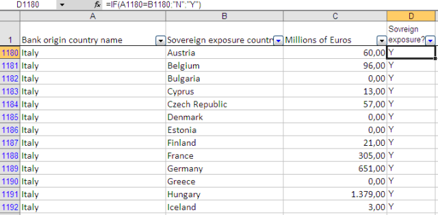
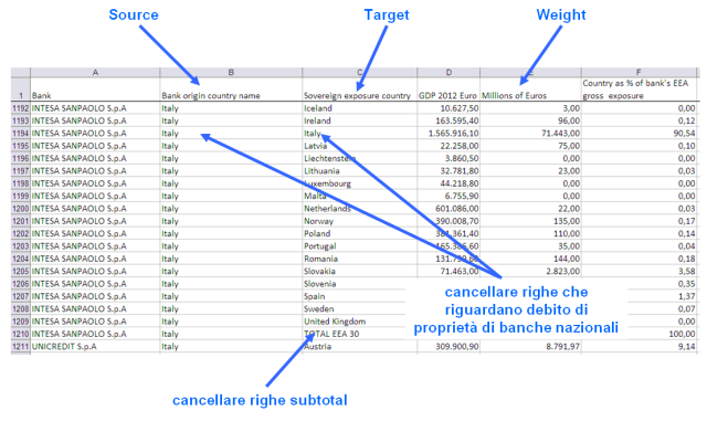 Para borrar el subtotal y las líneas con respecto a la deuda que se mantiene dentro de las fronteras nacionales pueden utilizar para campos de cálculo con una simple SI fórmulas :
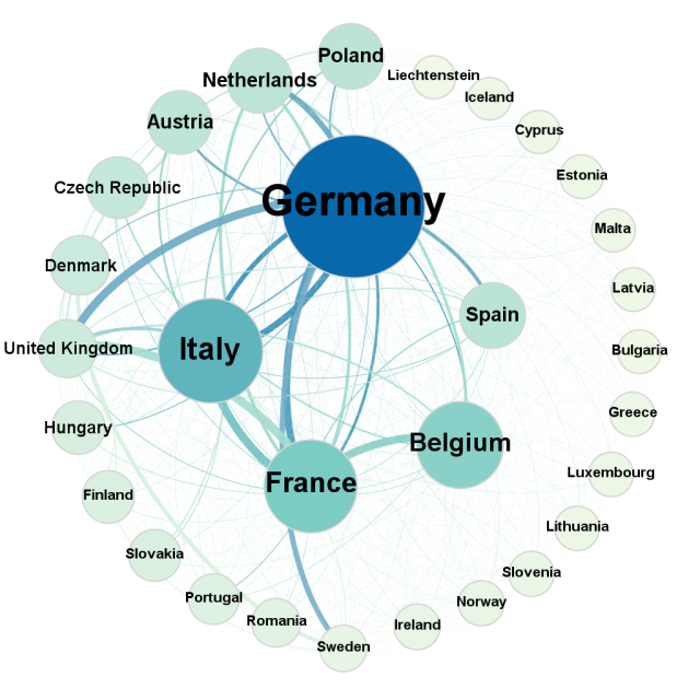 Una forma de representar a la agrupación de datos es un diseño con un círculo doble ( doble planta circular ), el círculo íntimo de los 5 países que tienen una mayor fragmentación de la deuda soberana en los círculos exteriores de las naciones restantes. El tamaño de los nodos es proporcional a la cantidad de la deuda y el color cambia a azul dall'azzuro acuerdo con la misma métrica.
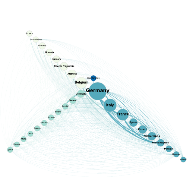 Una representación posible explota el potencial del diseño del eje radial . Los grupos fueron más fuertemente se distribuyen en 3 ejes y ordenados de acuerdo a la cantidad de la deuda soberana. El color de los nodos, en este caso, identifica la pertenencia a un grupo específico de estados. En la figura anterior se puede ver la situación particular de Liechtenstein, que se encuentra en el centro de los dos grupo liderado por Alemania y Bélgica.
 Una representación posible explota el potencial del diseño del eje radial . Los grupos fueron más fuertemente se distribuyen en 3 ejes y ordenados de acuerdo a la cantidad de la deuda soberana. El color de los nodos, en este caso, identifica la pertenencia a un grupo específico de estados. En la figura anterior se puede ver la situación particular de Liechtenstein, que se encuentra en el centro de los dos grupo liderado por Alemania y Bélgica.
